
How Can Interior Signs Improve a Workplace or Customer Experience?
Interior branding is easier to brief when you describe a moment rather than a wall. A member approaching a gym reception and a customer waiting at a money-transfer counter need different information. The empty surface is not the starting point; the person’s position, next action and view through the room are.
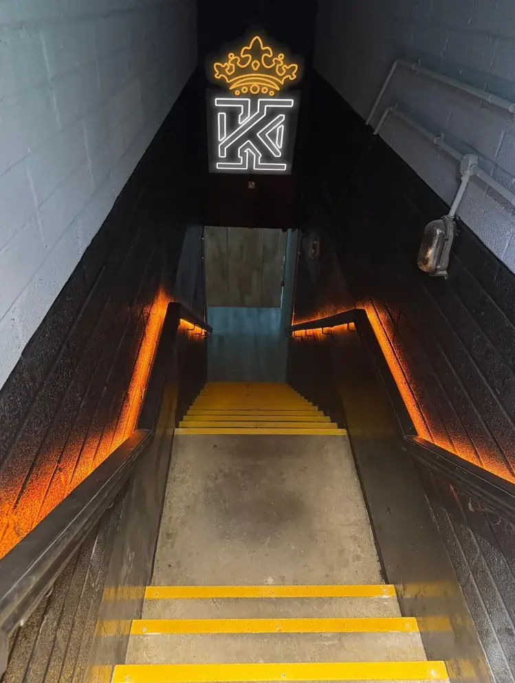
Kings Gym: the brand appears along an arrival sequence
At Kings Gym Tower Bridge, the project record begins with the stairs, turnstile, reception counter and staff work area. Survey information became a spatial model with several viewpoints. The completed stairwell places the illuminated crown and K identity above the route, with warm amber handrail lighting, yellow stair-edge details and coordinated dark finishes.
The lesson for a similar brief is to review the sign in the approach view and in relation to other fittings. That does not mean copying the lighting or colour scheme into a different workplace. A clinic, shared office or quiet reception may need a very different emphasis, and any accessibility or safety requirement needs its own assessment.
View the Kings Gym Tower Bridge project — The case study includes the spatial design and completed interior.
Ria: the identity continues at the point of service
The Ria branch uses the orange-and-blue identity outside and inside. The interior record includes the customer-service counter, illuminated front panels, a dimensional Ria logo, skyline graphics and digital campaign displays. Here the useful comparison is the relationship between the frontage and the counter, not an illuminated sign above a stair route.
For a counter-based business, decide which information is permanent and which changes. A fixed logo may provide identification, while service instructions or campaign content may need a replaceable display. Giving every message the same permanence makes later changes harder and can leave a reception full of outdated wording.
Reception signage options — Separate permanent identification from instructions and campaign information when specifying the customer-service area.
View the Ria Money Transfer exterior signage and interior graphics project — Compare the shopfront and counter photographs in the published project.
Use these two examples to identify the touchpoints in your own space before listing the products you want to buy:
- At arrival: what tells someone they have entered the right business or department?
- At the next choice: what directs them to reception, a room or a service position?
- At the destination: what confirms they are in the correct place?
- At a waiting area: which messages are useful there, and who will keep them current?
Mark these locations on a plan and take a photograph from the person’s likely viewing position. Some touchpoints need a sign; others may be better served by a clearer layout or removing competing information. Use the review to avoid commissioning a large feature logo while leaving basic arrival instructions unresolved.
What to approve in the space, not just on screen
Check the proposed size and placement against furniture, doors, screens and the actual finish being fixed to. Review material samples under the room lighting where possible. Close-up surfaces may expose edges, fixings and reflections that a small digital mock-up does not show, so include those details in the approval rather than only approving the logo artwork.
Finally, decide how the scheme will be maintained when a tenant, room use or service changes. Keep artwork and product information, and distinguish the fixed brand elements from changeable labels. Neither of these project records establishes a measured improvement in customer satisfaction or staff productivity. They show real design decisions and completed installations that can help you ask a more useful set of questions for your own interior.
Test the visitor route before choosing signs — Use arrival, junction and destination checks to keep the interior identity useful as well as visually consistent.
From the journal
Featured articles
More practical ideas for your next signage project.
More published stories are on their way. Explore the journal for now.