Case study / Window Graphics
Branding in the glass
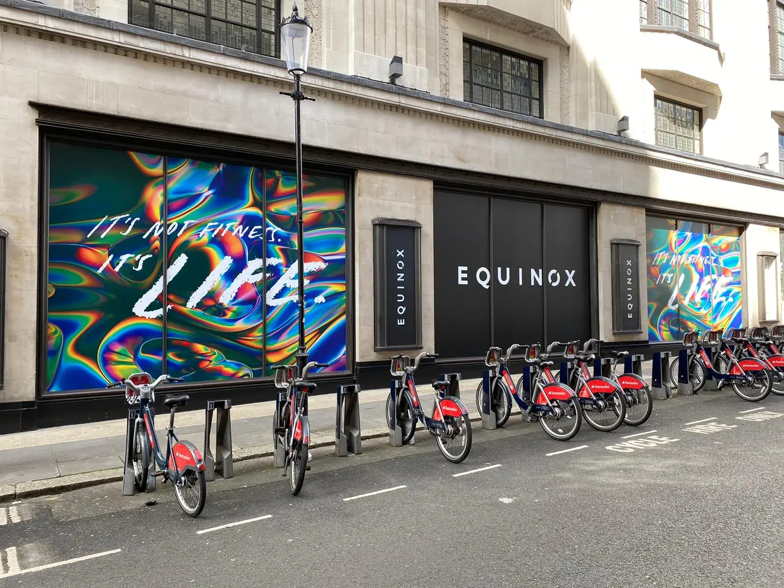
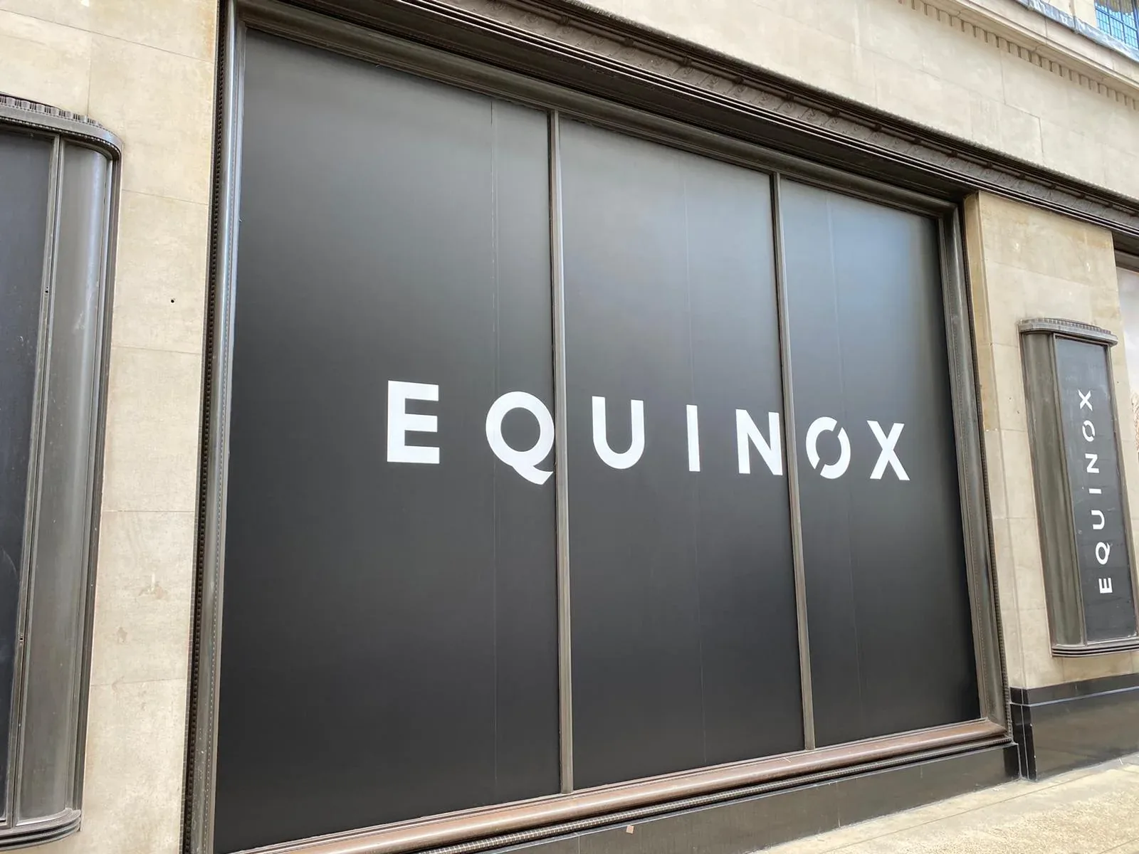
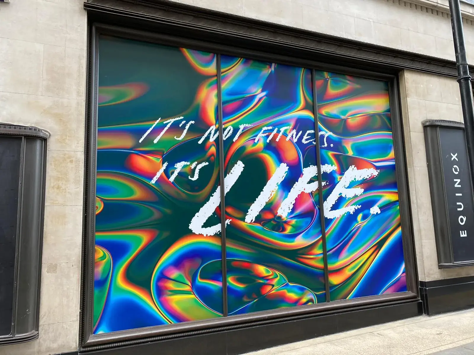
Equinox window graphics combining restrained black identity panels with vivid full-window campaign artwork across the Kensington frontage.
What the photography shows
ORIGINAL WORK.
RECORDED ON SITE.
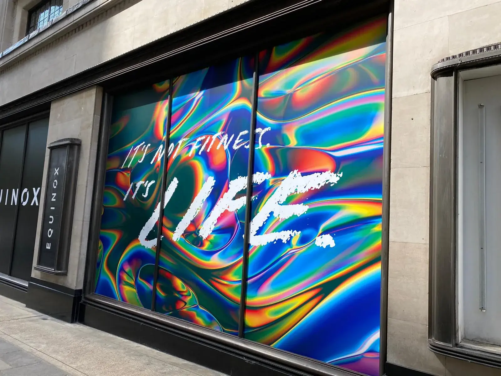
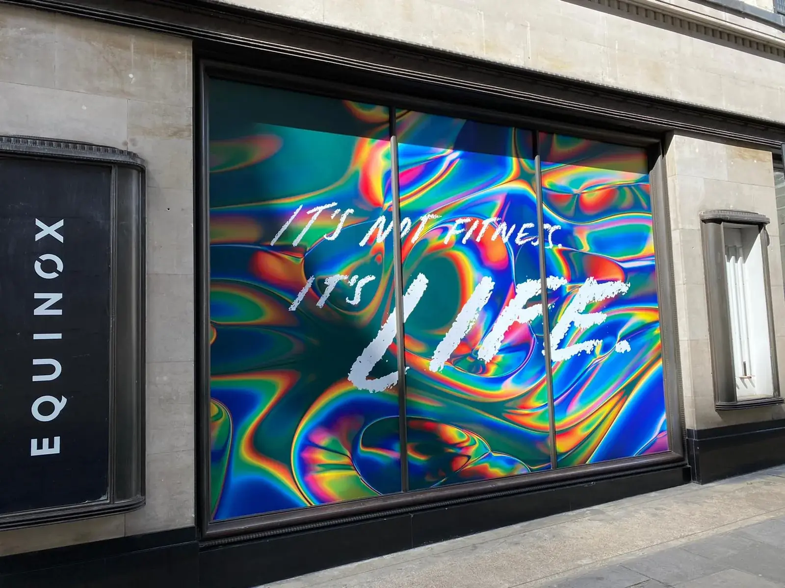
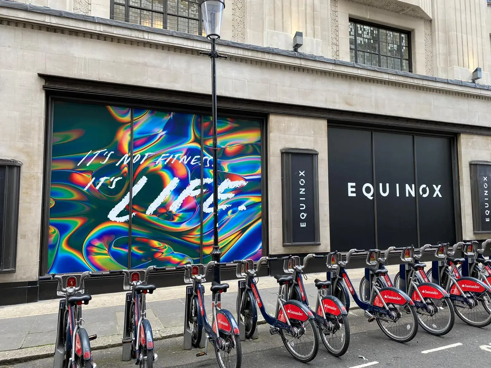
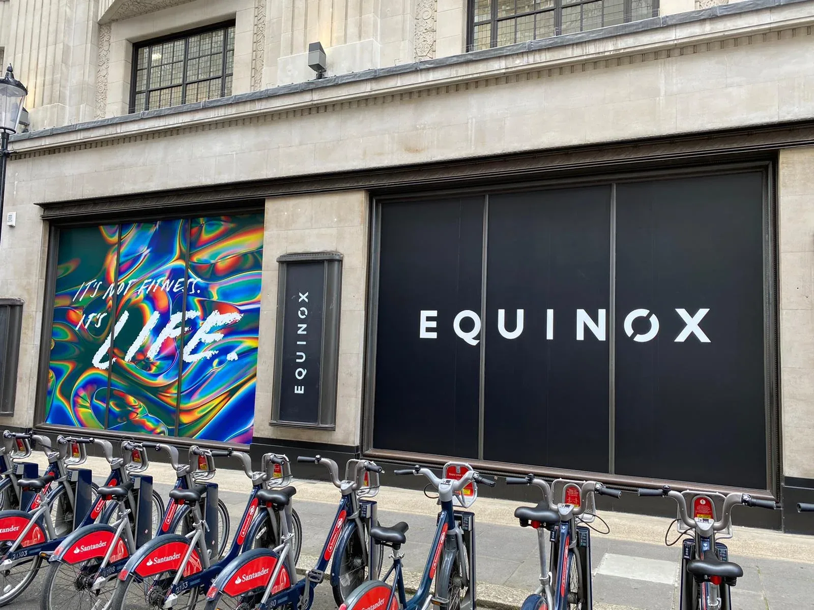
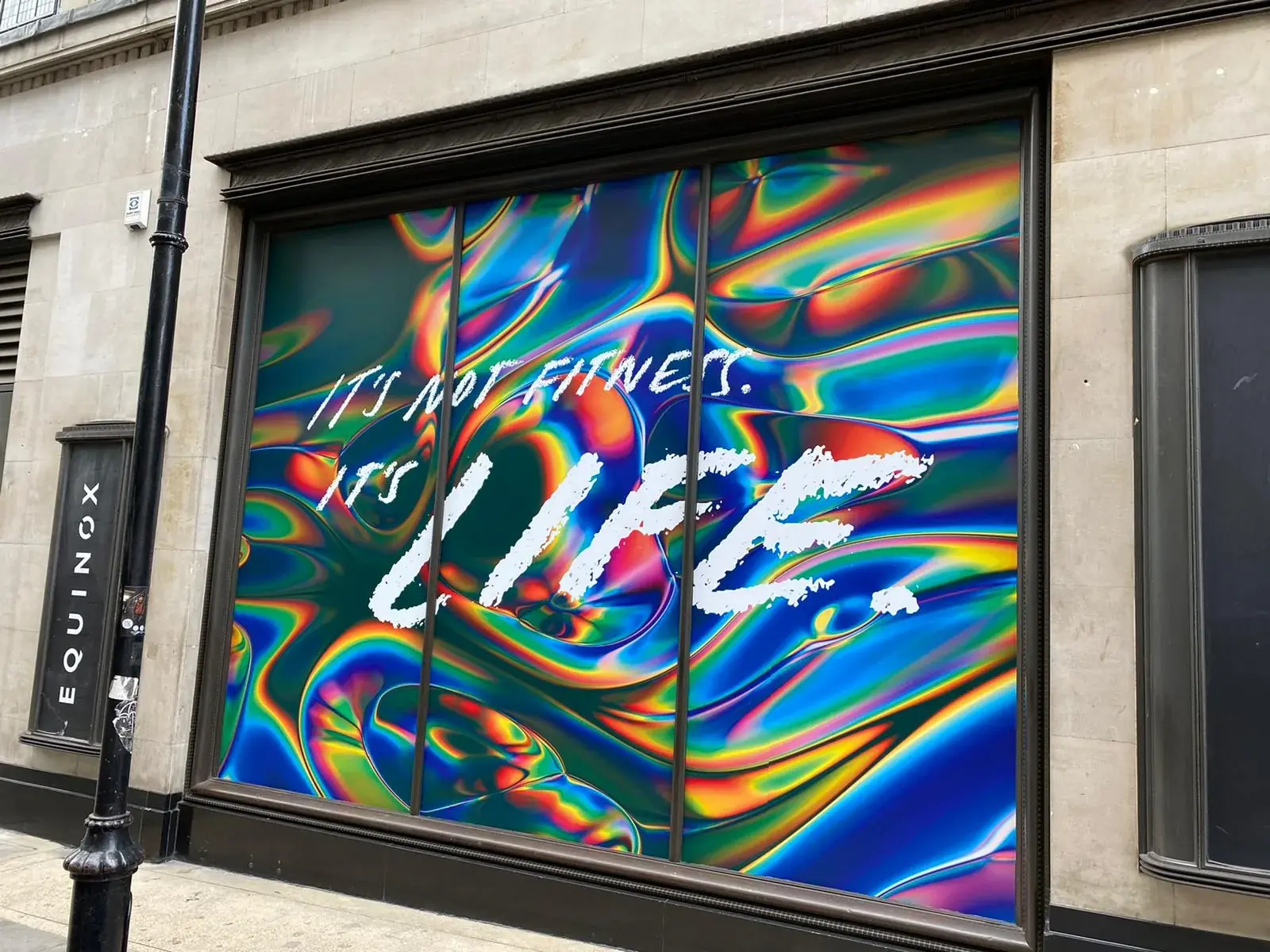
This Equinox frontage uses two contrasting treatments across the same architectural elevation. Matte-black window panels carry the white Equinox identity with controlled spacing across the mullions, while adjacent full-window graphics introduce a high-colour campaign and the message “It’s not fitness. It’s life.” The photographs show how both approaches were aligned within the existing stone surrounds, dark frames and narrow vertical brand panels.
Visible details
- Black full-window identity panels
- White Equinox logo lettering
- Vivid full-colour campaign print
- Artwork divided accurately across window mullions
- Large “It’s not fitness. It’s life.” campaign message
- Coordinated graphics across separate frontage bays
Photographed result
The completed treatment creates a clear rhythm across the frontage: black logo windows provide a consistent brand anchor, while the colour campaign panels deliver visual impact from further along the street. The wide views show both treatments reading together as one installation rather than as unrelated window displays.
Original project photography
THE COMPLETED
INSTALLATION.
Planning something similar?
EXPLORE WINDOW GRAPHICS.
See the service options, then share your location, artwork and project requirements for a tailored quote.