Shop Sign Design
Classic or Modern Shop Signs? How to Choose
Compare classic lettering with a cleaner modern look, and find a sign style that suits your shop, building and customers.
Picking a sign style is not a contest between old and new. A classic painted look may suit a family shop with a long history, while clear modern letters might suit a new café or studio. Both can look welcoming, and both can look out of place if they ignore the building or are hard to read from the pavement. Start by thinking about what you want a customer to feel and notice. Then look at the shopfront, the street, the light and the time people have to read the sign. This guide gives shop owners a practical way to compare styles, materials and lighting without chasing a trend that may not fit their business.
Know what you mean by classic and modern
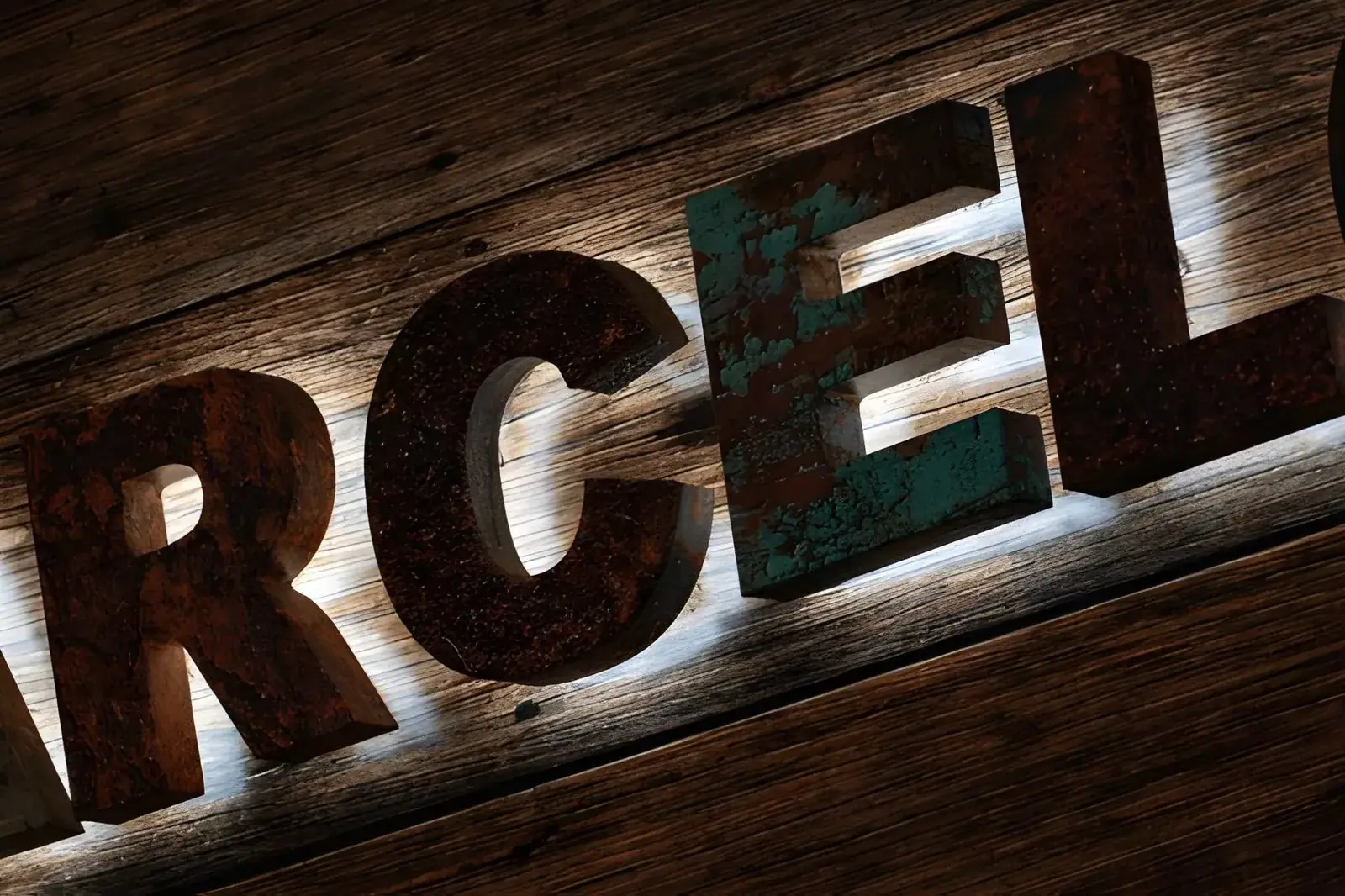
A classic sign might use familiar letter shapes, a painted board, a simple border or a small number of colours. It can feel friendly and settled, but it does not have to pretend to be old. A new sign can have a classic look without claiming that it has been there for a hundred years. Think about which details you actually like: perhaps the shape of the letters, a warm colour or a hand-painted feel. Naming those details gives a sign maker something useful to work with.
A modern sign may use plain letter shapes, strong lines, bright colours or separate letters that stand away from the wall. It does not have to be a screen, all white or very shiny. It can be simple and warm too. Ask what you want a passer-by to think: “This place looks welcoming,” “I can tell what they sell,” or “I know where the entrance is.” One clear aim can guide the design better than a loose request to make the shop look modern.
Look at the building and the street first
Take a step back from the shop and look at it as a customer would. Is the street narrow or wide? Is the shop hidden beside a bigger business? Is the front door easy to spot? A small shopfront may need a short name in large letters, while a broad wall may leave room to spread the words out. The sign should fit the building rather than look like it was chosen without seeing the place. Take a photo from across the road and another from the direction people normally approach.
Look at what is behind the sign too. A pale sign on a pale wall can disappear. Thin letters may be hard to see from the other side of the street. Reflections in window glass can make small words difficult to read. Think about whether customers come during the day, after dark or at both times. If your shop closes before dark, lights may not matter as much as they do for a restaurant that welcomes evening customers.
Before choosing a style, check with the building owner about where signs can go and what fixings are allowed. Some buildings have rules to protect their appearance. Ask before paying for a final design or making the sign. If permission from a council or another group may be needed, get advice from the right person. A design that looks perfect in a picture may still need to change if it cannot be fitted to the building.
Pick materials that suit the place
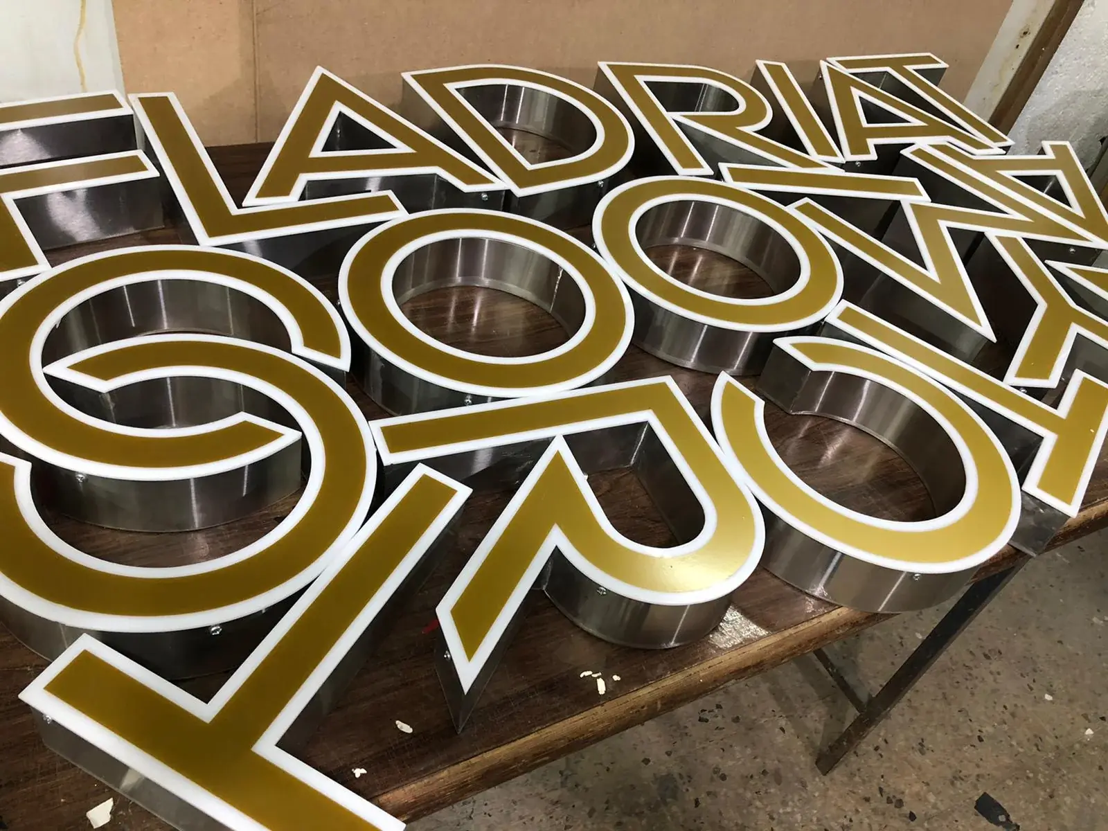
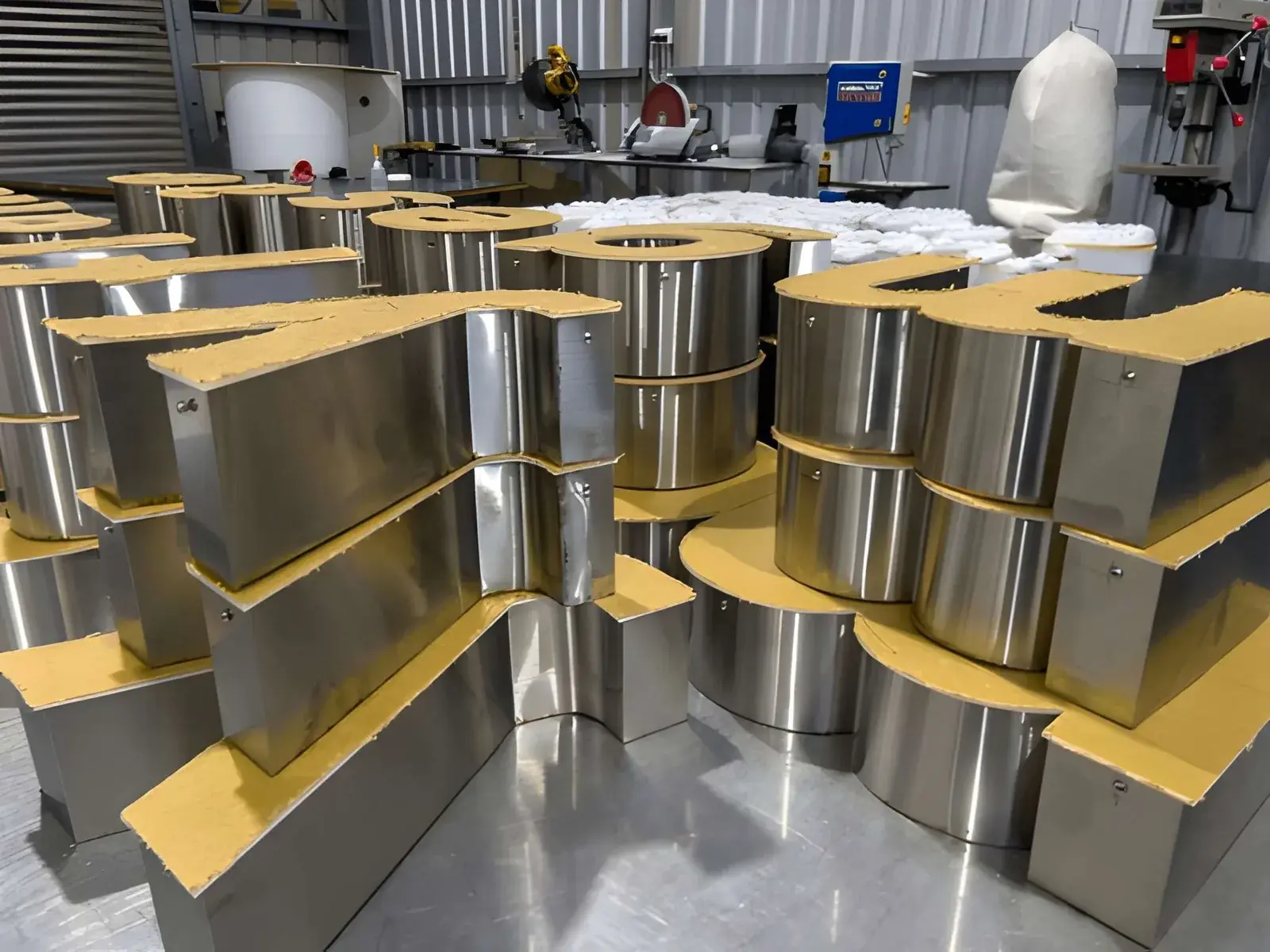
Different sign materials give different looks and need different care. A painted board can feel simple and handmade. Metal letters can have a smooth or brushed surface. Acrylic is a hard, coloured plastic that can be cut into letters or panels. These are choices about the look, weight and fitting as well as the price. Ask what the sign is made from, how it will be held in place and how you should clean it. A useful answer should talk about your wall and location, not just say that one material is best for everyone.
Ask to see a sample if the colour or surface matters to you. A tiny picture on a phone may not show how the material looks in daylight. Check the sample against the shop wall if possible. Ask whether rain, sunlight or cleaning could change its appearance and what care it may need. No sign stays perfect forever, so it is sensible to learn what small repairs might be needed later.
- Look at samples outside and indoors.
- Check the words from the place customers will see them.
- Ask how the sign attaches to your wall.
- Find out how to clean and look after the finish.
Decide whether light or raised letters will help
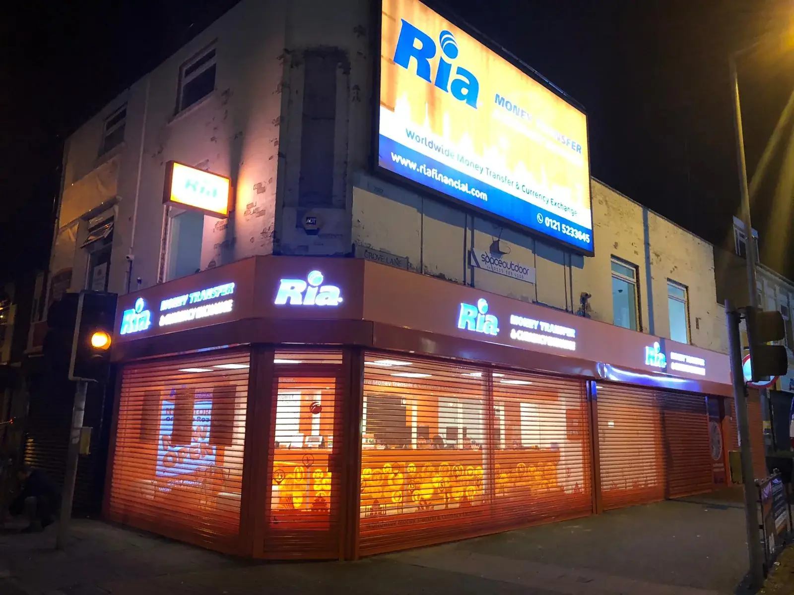
A lighted sign can help people see your name when it gets dark. It can also change the mood of the shopfront. Some letters shine from the front; others glow softly around their edges. A lit panel is another choice. Ask to see how each kind looks and find out where the power wire will go. Think about neighbours and nearby homes too. The aim is to help customers find your business, not to shine so brightly that the sign bothers people nearby.
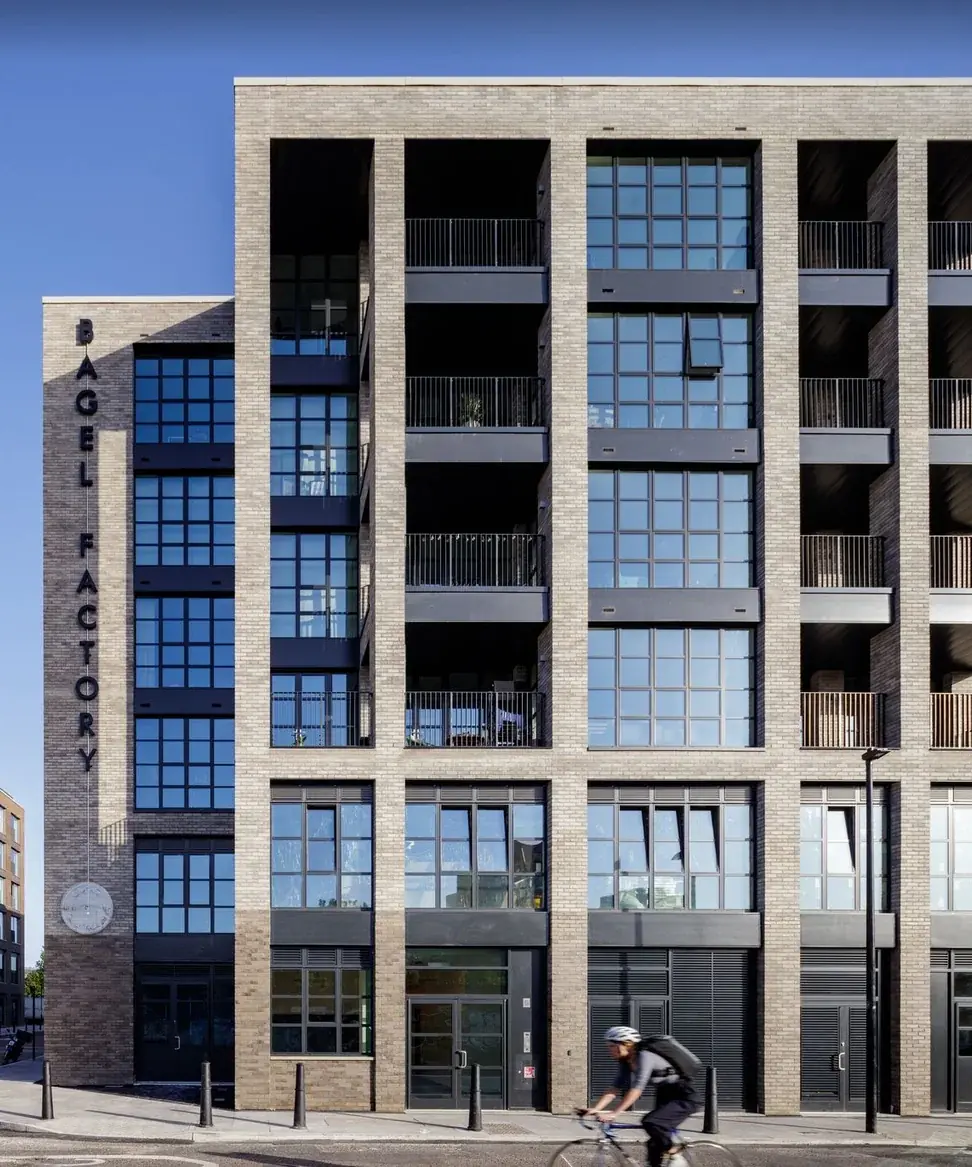
Raised letters make a small shadow because they sit away from the wall. That depth can look smart with a classic or modern style. The size, spacing and thickness of the letters matter: an unusual shape is no help if someone cannot quickly read the name. Ask to see a picture of the sign from the front and from the side. A side view shows how far the letters stand out and can help you imagine how they will look on your shop.
Keep your shop name easy to spot
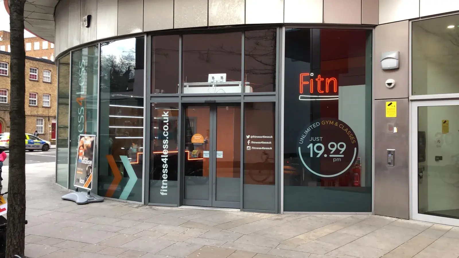
The most important job of the main sign is usually to show the business name. Use your real logo and colours if you have them, but check that they still work at the size of the sign. A tiny slogan, long list of services or phone number can crowd the name. Put extra details on the window or a smaller sign where people can stop and read them. Someone walking by will not have long to work out what the shop is called.
Do not choose a style only because another shop has it. Your neighbour’s frontage, customers and opening hours may be different from yours. Compare two or three ideas on a photograph of your own shop. Look at each one from the pavement, not only close up on a computer. Check that the words can be read, the colours feel right and the sign does not hide a door or window. A simple check now is much easier than wishing you had chosen differently after it is fitted.
Mix classic and modern details if you like
You do not have to choose just one style. A familiar painted sign could sit above a clean modern window message. A brick shopfront might use metal letters with a classic letter shape. One clear mix can make the place feel both fresh and familiar. Keep the number of colours and styles small so the front does not feel busy. Give the business name the biggest role, and let other signs share details such as opening times.
Start by deciding what you want to keep. It could be the old colours, a mark customers know or a detail in the building. Then name what is not working. Maybe people cannot see the name at night, the letters are too small or the sign no longer matches the shop inside. Change the parts that cause trouble, not every part just because it is possible. A small, thoughtful change can help the shop feel new without taking away its character.

Make a choice you can feel good about
Before you ask for a design, gather a clear shop photo, rough measurements, your logo and the words you need. Tell the sign maker who your customers are, how they arrive and whether they visit after dark. Share a few signs you like, and explain what you like about them. Ask for a small number of different ideas and a note about how each would be made, fitted and looked after. It is easier to compare a few clear choices than a pile of styles with no reason behind them.
London Signage can talk through sign design, making and fitting with the shop and its surroundings in mind. There is no single winner between classic and modern. Choose the sign that shows what your business is, fits the building and is easy for customers to spot. Look at the drawing from the pavement and ask about the material, fitting and any permission needed. Take your time before saying yes. A sign is part of the first hello your business gives to people walking past. Bring a photo and your shop name to start a useful conversation for your customers and team.
Commercial Signage London — See sign ideas for different shopfronts.
Talk with London Signage — Share a photo and tell us what you have in mind.
Ask for a sign quote — Send the sign details you are considering.
Questions about classic and modern signs
Frequently asked questions
Does a classic-looking sign have to be painted by hand?
No. A sign can have classic letters and colours and still be made with newer tools. The look and the way it is made are separate choices.
Can a modern sign work on an older shop?
It can, if it fits the building and does not hide important details. Check with the owner about fitting rules and ask whether any permission is needed.
Which kind of sign is easiest to read?
The words, size, colour contrast and viewing distance matter more than whether the style is classic or modern. Check a drawing from the pavement.
Can I mix classic and modern styles?
Yes. Keep the main shop name clear and use just a few colours and styles so the front still feels joined up.