Sign Design
How to Design a Sign People Can Read at a Glance
Make business signs easier to notice and understand with clear wording, strong contrast, useful lettering and a simple real-world check.

A sign has only a moment to do its job. Someone walking down a busy street may glance up for a shop name, while a visitor at a front desk may have time to read a longer message. In both cases, the words should be easy to notice and understand. Good design is not about adding more decoration. It is about choosing the right message, making the important part stand out and checking that the sign works where people will see it. A business owner can make a strong start by answering three simple questions: who needs this sign, what should they learn, and from how far away will they read it? The answers guide the words, size, colour and shape. They also help keep a sign useful rather than crowded.
Decide what the sign needs to say
Give each sign one clear purpose. A shop sign may need to show the business name. A door sign may tell people where to enter. A panel inside a clinic might point visitors towards reception. Write that purpose in one short sentence before choosing colours or lettering. “Help a first-time visitor find the front desk” gives a designer a clearer starting point than “make the lobby look exciting.”
Think about what the reader already knows. A regular customer may recognise your logo, but a new visitor may need a few more words. A sign beside a counter can explain an offer because people can stop to read it. A sign above a busy road needs very few words because drivers have little time to look. Match the message to the moment.
Make a list of must-have details and nice-to-have details. The business name, room name or safety instruction may be essential. A slogan, social media name or extra sentence may not be. If everything will not fit comfortably, remove something or use a second sign. Shrinking all the words to squeeze them onto one panel can make the message hard to read.
Make the most important words stand out
People should be able to tell at a glance which words matter most. Give the business name more space than a small extra message. On a direction sign, make the destination and arrow easy to spot before decorative details. Put related words close together and leave clear space around separate messages. Crowded words take longer to understand.
Look at the design from the place where people will see it. A sign across a courtyard needs larger words than a small notice beside a door. Think about whether someone will be walking, standing or driving past, and whether they will see it straight on or from the side. A design that looks balanced on a computer may feel cramped when printed at its real size.
Try a quick test: show the design to someone who has not heard your explanation. Ask what they noticed first and what they think it says. If they look in the wrong place or guess the wrong meaning, make the message simpler. A sign should not need a long explanation from its owner.

Pick lettering for its size and viewing distance
Letter styles can look very different on a screen and on a building. Thin strokes may disappear against a busy background, while letters placed too close together can blur into one another from across the street. A decorative style can suit a short business name, but a plain, familiar style is often better for instructions and directions.
Check words at the size they will be made. Print a paper copy or place a correctly sized design over a photograph of the building. Walk back to the distance where a customer will first see it. Can you read the name quickly? Check numbers and punctuation too, especially phone numbers, opening times and door numbers. If your sign uses more than one language, leave enough room for the longer version.
Upper-case letters can work for a short name, but a whole paragraph in capitals is harder to read. Keep supporting words brief and give lines enough breathing room. Ask a few people with different levels of familiarity with your business to read a proof. Their questions can show where a word or letter shape is unclear.
Use colour so words are easy to see
A clear difference between the words and the background helps a sign stand out. Dark words on a pale background or pale words on a dark background are common choices, but the exact colours depend on the place. Sunlight, indoor lights and reflections can change how colours appear. A colour combination that looks clear on a laptop may be difficult to see on a shiny shop sign in bright sun.
Use a small number of colours and do not rely on colour alone to explain something. Add a word, arrow or simple symbol as well. For example, a red area should not be the only clue that an entrance is closed. Try viewing a draft in greyscale: if the words disappear, the contrast may be too weak. A material sample at the actual site can help you judge the finish in its real light.
Choose a shape and material that suit the place
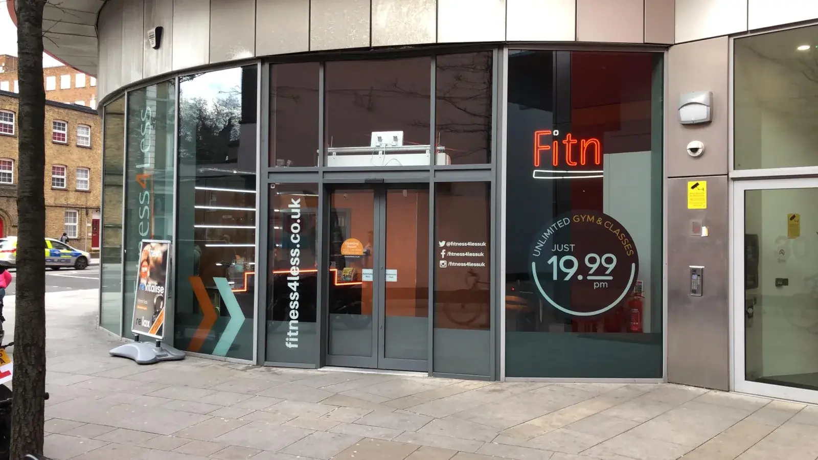
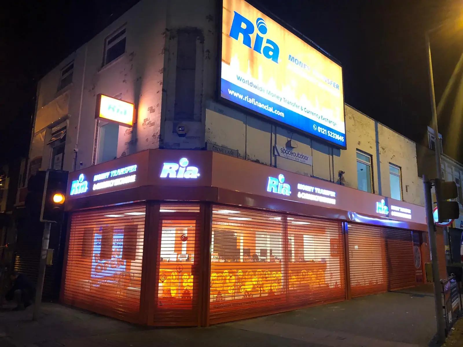
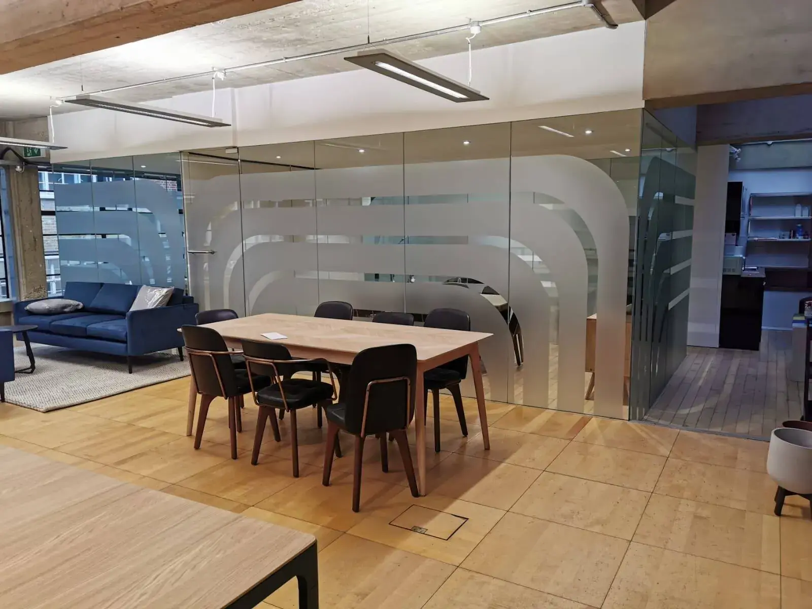
A flat panel, window vinyl, projecting sign and raised letters all give a different look. Vinyl is a thin sticky film with printed words or shapes. Raised letters sit out from the wall and add depth. Think about the building, nearby signs, rain, cleaning and how the sign will be fixed. A polished metal finish may look smart indoors but create bright reflections under strong lights.
Consider how the sign will look after daily use. Pale colours and fine borders may show dirt or wear more than a simpler design. Ask how the surface should be cleaned and whether a damaged part can be replaced. A sample and a drawing with real measurements help you decide before anything is made. They also make it easier to check that the design fits the space.
Check the design before it is made
Read every word slowly and check names, numbers, spelling and opening times. Compare the design with the wall or window measurements. Make sure it will not cover a light, door number, window or useful view. If the sign is large or in a tricky spot, ask for a picture showing how it may look on the building. This can reveal a problem that is hard to see on a flat page.
Save the final approved version and make sure everyone is using that same version. If a word, size or position changes, check the new proof again before it is made. Ask someone unfamiliar with the project to read it without help. Keep a record of approval and any building-owner check that is needed. A few careful checks are easier than fixing a sign after it has been fitted.

Conclusion: design for the place people will read it
A useful sign starts with a clear purpose and a real reader in mind. Keep the main message easy to spot, choose lettering that suits the viewing distance and use colours that stand apart from the background. Match the shape and finish to the building, then review the proof at its real size before approving it. London Signage can help businesses think through signs for shopfronts, workplaces and other business spaces. Explore the signage service, contact the team with the message and location, or ask for a quote with measurements and photographs. A few practical checks can make the difference between a sign that looks good on screen and one that works for customers outside your door.
Commercial Signage London — Look at sign types for shops, offices and other spaces.
Talk through your sign idea — Share what it should say and where people will see it.
Ask for a sign quote — Send measurements, pictures and any artwork you have.
Frequently asked questions
What should I think about first when designing a sign?
Start with the reader and the main message. Decide what a person should notice or do, then think about the distance and place where they will read it.
How can I tell if the words are large enough?
Check a correctly sized proof from the usual viewing spot. Ask someone who has not seen the design to read it without help.
Do all my signs need to use our brand colours?
Brand colours can help signs feel connected, but the words still need to stand out clearly. Adjust the colours for the background and light at each location.
Why should I check a sign on a picture of my building?
A picture can show whether the sign feels too large, sits in the right place or clashes with a window, light or nearby feature.