Office sign planning
Build a Better Office with Clear Signs
Plan office signs that welcome visitors, show your business character and help staff find rooms without covering every wall in branding.
People experience your office as they arrive, find a room and meet your team. Signs can make those moments easier while showing something about your business. A reception logo, room names, glass pictures and direction signs all have different jobs. If each is planned on its own, names may not match and visitors may be unsure where to go. This guide is for business owners and office managers planning a welcome that feels right and works in daily use. You do not need to put your brand on every wall. Start with the route people take, then choose signs that help them and suit the rooms.
Walk the route a visitor takes
Start at the building entrance and follow the route to reception, a meeting room or the person a visitor is coming to see. Notice doors, lifts, shared halls and places where someone might have to choose a direction. Ask a colleague who is new to the office to try the route without help. Where do they pause or ask a question? Those moments show where a sign might be useful.
Staff can point out questions visitors ask often, such as which floor to use or where to wait. Keep those answers separate from slogans or decoration. Someone who has just arrived may need a room name more than a brand message. Draw a simple plan and mark where signs might go. This helps the team decide what is needed and can stop several signs saying the same thing.
Make reception feel like your business
Reception is often the first room visitors see. Raised letters, a flat sign or a wall picture can make the area feel welcoming, but the size should suit the room. Think about what a visitor sees from the door, where the desk sits and how the light falls. Ask to see a drawing that shows the sign on the actual wall, not just a logo by itself on a blank page.
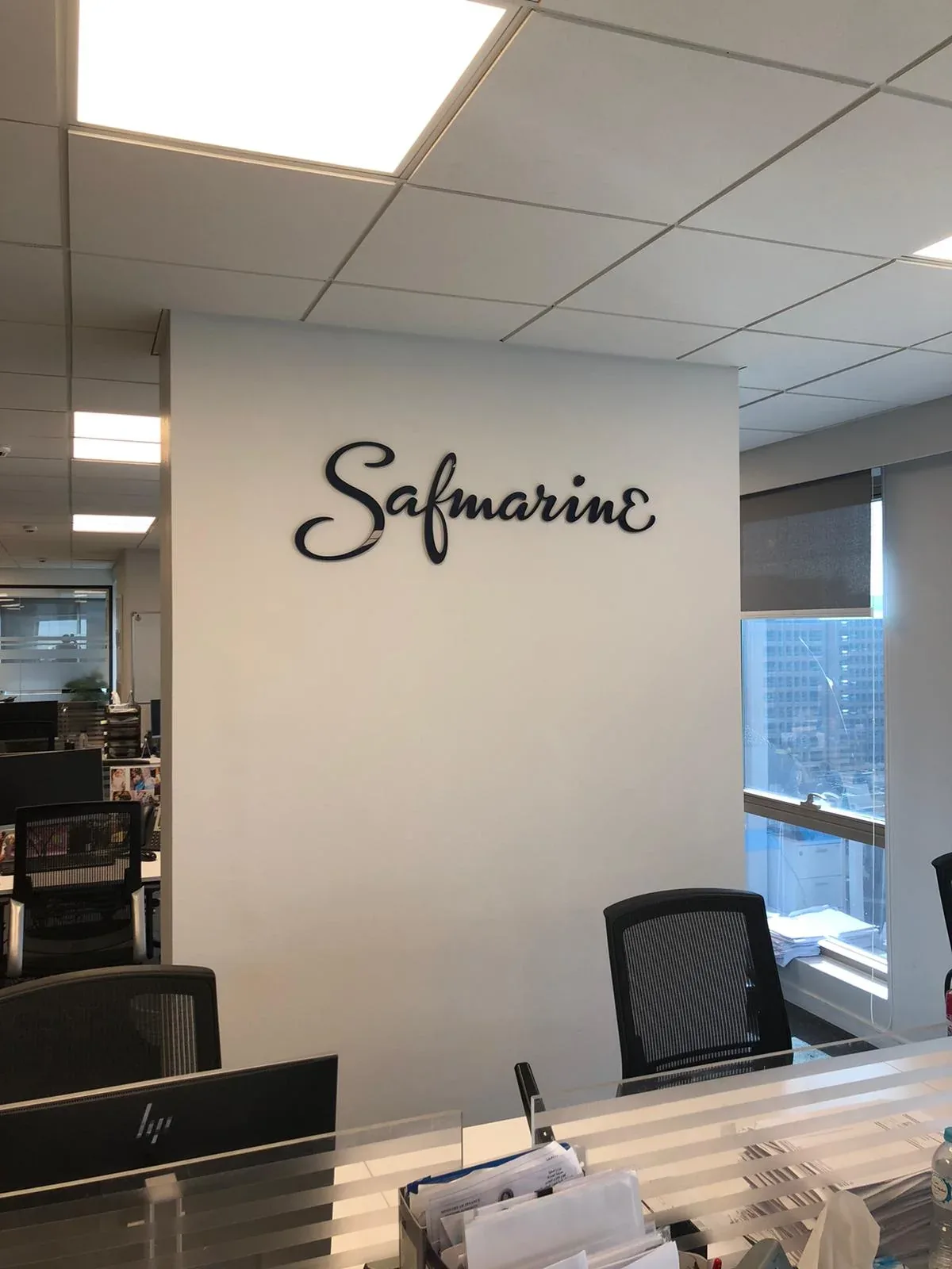
The reception feature can connect with the rest of the office without repeating the same look everywhere. Use the same approved logo and colours, then choose simpler room names and direction signs for corridors. If your business has more than one logo, decide which one belongs in each place. Keep a copy of the choice so new signs match later. The Safmarine wall logo shown here is one example of raised letters used inside a workplace.
Choose signs that suit how the office is used
A raised letter, acrylic panel, printed board or cut vinyl can each suit a different place. Vinyl is film that sticks to a smooth surface, such as a wall or glass. Ask how each choice looks in your office light, how it attaches and how it should be cleaned. If a message may change often, ask whether it can be replaced without changing the whole sign. A permanent logo and a temporary room notice may need different choices.
Think about how your office may change. Teams move, rooms get new names and the business may refresh its logo. Ask what parts of the sign could be updated later. Keep the lasting features for things that are unlikely to change, such as the main business name. Use a more changeable sign for details that may need updating. That can make the office easier to manage over time.
Use glass pictures with care
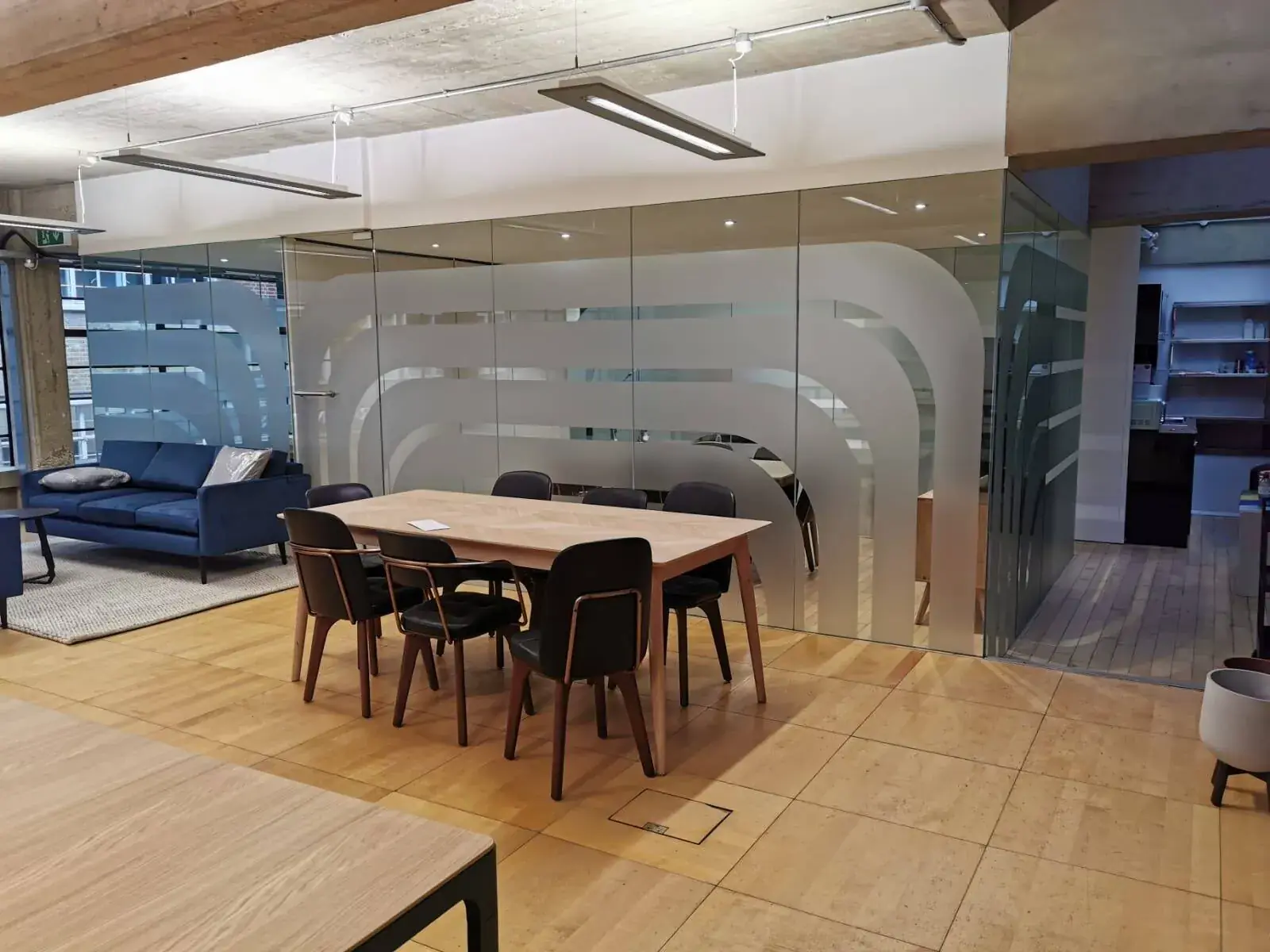
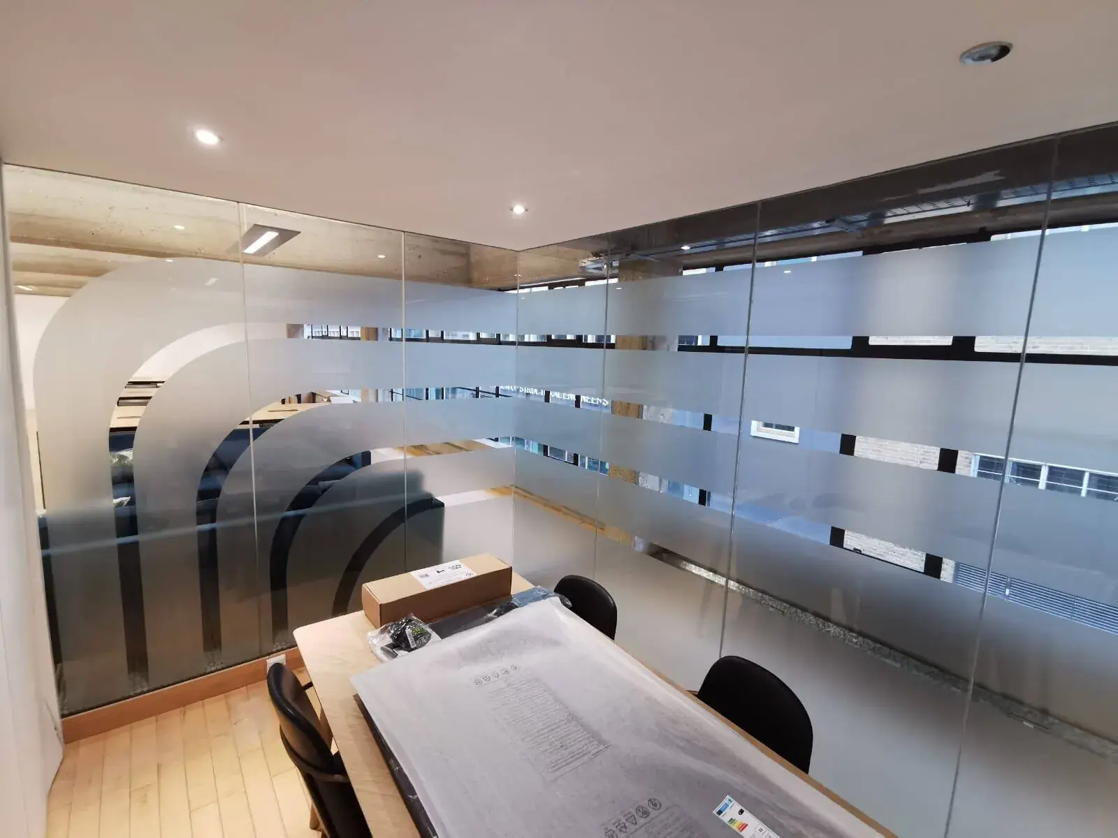
Clear glass rooms let light through, but people may not notice a glass door or wall. A few simple shapes or a band of colour can make the glass easier to see and may give people more privacy. Ask where the pictures should go so they do not cover handles or block useful views. Check that the design can still be seen against changing backgrounds, such as a bright window or a busy meeting room.
Decide whether each room needs privacy, clear views or both. Ask how much the film hides, how it is cleaned and whether it can be removed. The right answer may be different for a meeting room and a private office. Existing glass and door seals can affect the fitting, so share photos or ask whether someone should visit. Office window graphics can be useful when they solve a real issue, not just because there is glass available.
Make directions easy to follow
Use the same name for each room on the door, directory and meeting invite. Put a direction sign before a turn, not after it. Use arrows that clearly point the way, and avoid short forms that only your staff understand. Ask someone unfamiliar with the office to read the signs. If they are unsure what “HQ-2” or an internal team name means, use a clearer name for visitors.
At the entrance, show the main places a visitor needs to find. Near a room, show its name or number. You do not need a full list of every room on every sign. For a larger office, keep a list of each sign, its words and where it goes. Check the list against the floor plan before anything is made. This is much easier than finding out on fitting day that a room name was missed.
Keep the words clear and easy to read
Your brand can look distinctive while the important words stay easy to read. Check that text stands out from the background and is large enough for the distance. Look for glare from windows or lights. Use colour to help people understand a sign, but do not make colour the only clue. Ask to see a sample at the planned size and view it from the hallway or entrance where it will be used.
Visitors may not know your building, team names or usual shortcuts. Use clear words, familiar symbols and signs at the places where people need them. If your workplace has particular access needs, ask the person responsible for the building or design to help check the plan. Signs are only one part of a welcoming office, but they can make everyday information easier to find and understand.
Fit signs around the office work
Office signs are often fitted while decorating, furniture or computer work is still happening. Ask the people managing the work when the walls will be clean and ready. A wall logo may need to be planned with shelves or lights, while glass pictures should go on clean glass. Check the sign positions against desks and chairs, too. Name one person to approve the drawings so different teams do not use different versions.
Agree when fitters can come in, where they can unload and which rooms need to stay open. Share the final room names, approved logo and floor plan before fitting. When the signs are up, walk the route as if you were a new visitor. Note any missing direction or room that is hard to find. Keep the sign list and artwork so future changes can match the rest of the office.
Commercial Signage London — See options for reception walls, lettering and other office signs.
Talk about your office — Discuss your floor plan and the signs you need.
Ask for an office sign quote — Share photos, a floor plan and your project details.
Office signs work best when they show your business and help people use the space. Begin with the visitor route, give reception a welcome that suits the room, and use the same names for rooms wherever they appear. Choose glass pictures or other features only where they help with privacy, visibility or the feel of the office. London Signage can discuss reception signs, wall letters, glass pictures and directions as part of an office plan. Explore the interior sign service or contact the team with a floor plan and photos to talk through your ideas. Keep those details handy as the workplace changes.
Frequently asked questions
Which office signs should I plan first?
Start with the entrance, reception, visitor directions and names for rooms or floors. Put signs where people need help choosing where to go.
What works best on a reception wall?
There is no one best choice. Think about the wall, room size, lighting, logo and how you may want to update the sign later.
Can pictures on office glass add privacy?
Some films hide more than others. Ask to see how much you can see through them and check cleaning, views and removal for each room.
How can I keep office signs matching as things change?
Keep the approved logo, room names and a list of where signs go. Update the list when teams move or rooms change names.