Customer Signage
Signs That Make a Business Visit Easier
Help customers feel welcome from the street to the counter with clear names, useful directions and messages that make sense.

A visit to your business starts before a customer opens the door. They look for your name, decide whether they have found the right entrance and try to work out what to do next. If a direction is missing or an old notice gives the wrong message, people may stop and ask for help. Clear signs can make that visit feel calmer, but more signs are not always better. The aim is to give the right message at the moment someone needs it. This guide helps shop, café and office owners look at a visit from the customer’s point of view, from the street to the counter and back out again.
Walk the route as a new customer
Start outside your business, not at the counter. Walk from the place most customers come from. Can you spot the name? Is the door easy to find? Once inside, can you tell where to go or who to ask? Notice where you slow down, turn the wrong way or look around for a clue. Those moments may need a sign. Sometimes a better furniture layout or a friendly greeting will fix the problem more simply.
Different visitors may have different reasons for coming in. A person collecting an order may need to find a collection point, while someone who wants to browse should be able to enter without feeling rushed. An office guest may need to find reception before looking for a meeting room. Ask the people who work with customers which questions they hear most. You can also watch the route during a busy time and a quiet time. That will show you where people need help, rather than where you only imagine they might.

Make the entrance easy to recognise
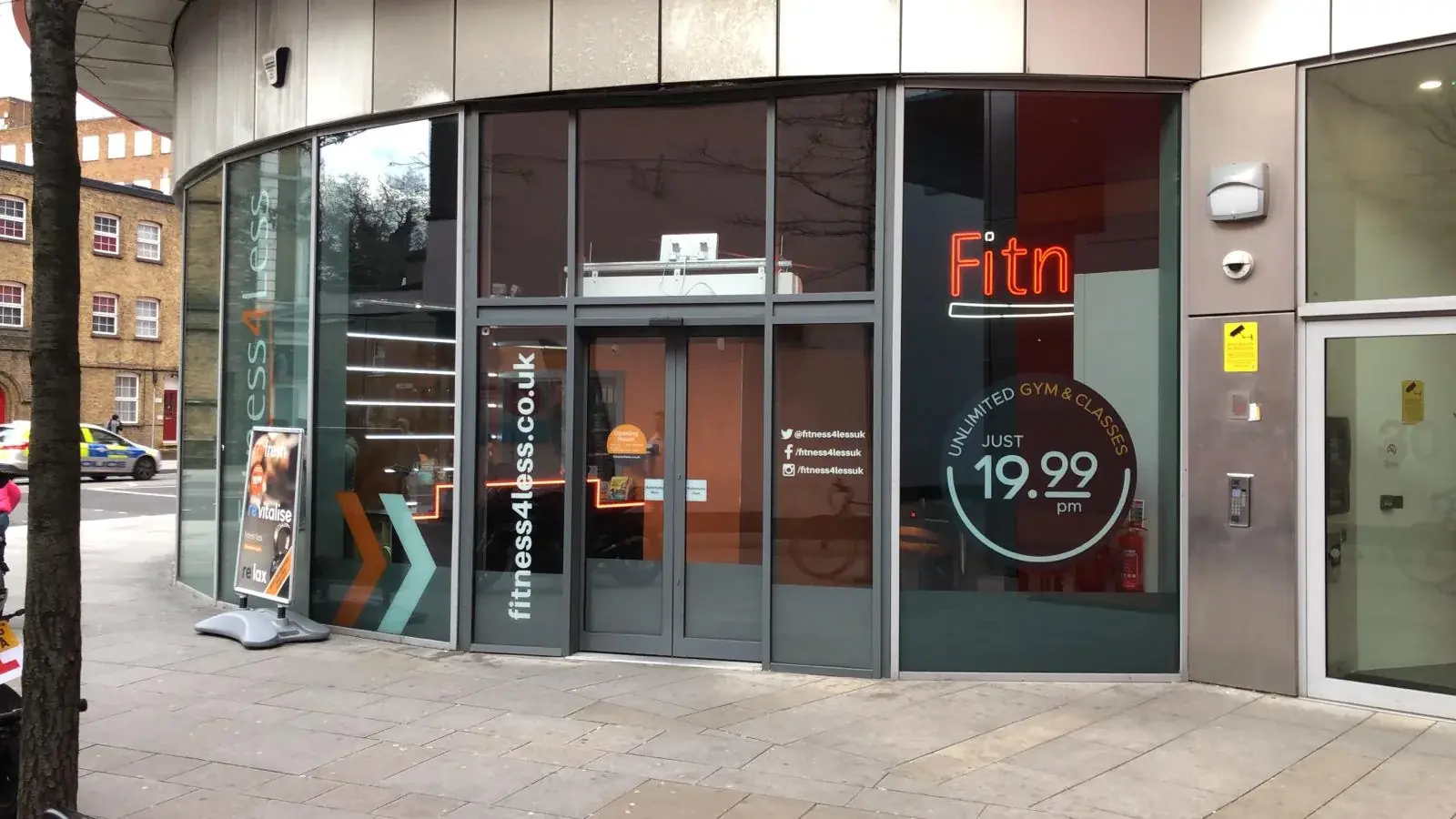
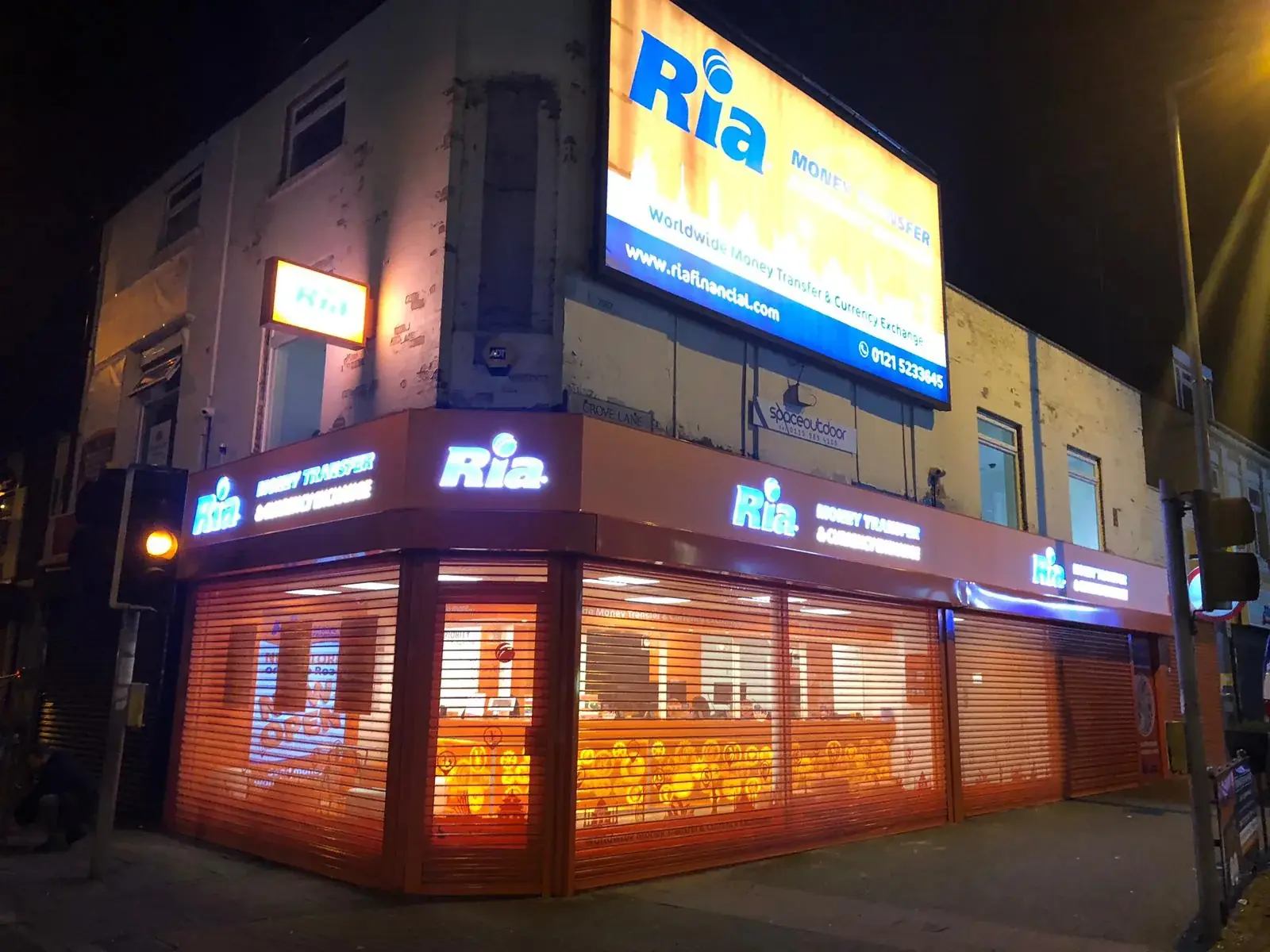
Put the business name where people can see it as they approach. A large sign may be easy to spot from across the street, while a small sign by the door can confirm that they are in the right place. Window pictures can show opening times, services or a short offer. Leave enough clear glass for people to see the entrance and inside of the shop. If every window is covered in writing, a new customer may not know where to look or whether the business is open.
At the door, give only the information people need right then. You might show opening hours, where to queue or whether customers should check in. Keep the words friendly and short. Put them where an open door will not hide them, and where people can read without standing in the way. Check that a temporary note does not disagree with the main sign. If you change your hours or service, update all the places that show the old information.
Put directions where people need to choose
A good set of directions works step by step. A visitor may need a sign at the entrance, another where a hallway splits and a name on the door at the end. A board in the lobby cannot help if the next turn has no clue. Put the direction before the place where someone must choose, not after they have already passed it. Use the same name each time. If one sign says “Studio 2” and another says “Room B,” visitors may not know that both mean the same place.
Keep each direction simple. At a busy crossing inside a building, a sign may need to name a few places and show arrows. At a single door, one room name is probably enough. Use arrows in a steady, familiar way. Ask a friend who has never been inside to find a room without your help. Watch quietly. If they make a wrong turn or stop to ask you, improve the sign or the route rather than blaming the visitor.
- Use the same names on signs and when staff give directions.
- Show the arrow before the place where a visitor turns.
- Choose letters that can be read from the right distance.
- Remove a temporary direction when it is no longer true.
Make signs clear and welcoming to everyone
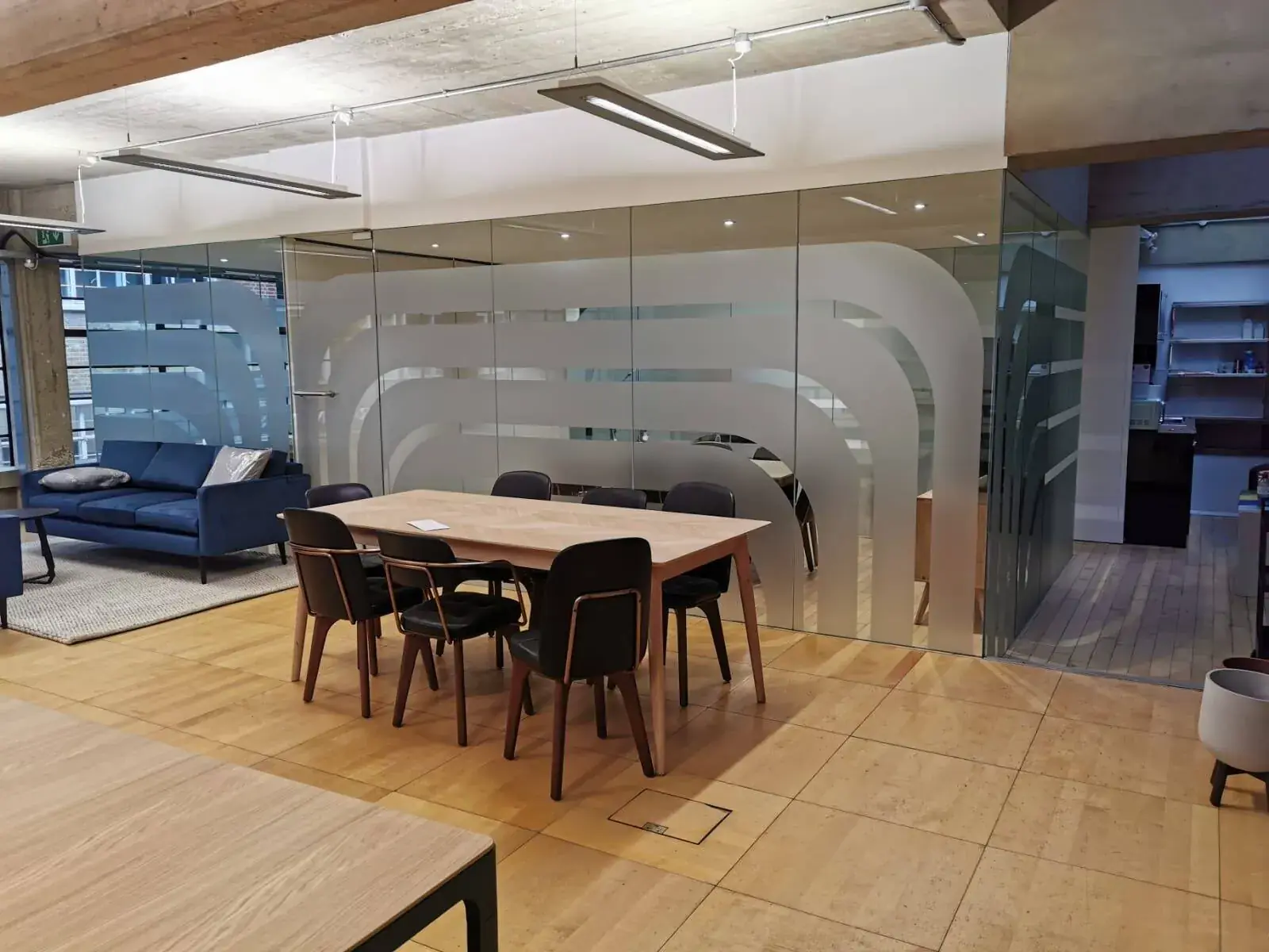
Use words that are large enough, with a strong difference between the letters and the background. A message that is easy to read close up may be too small across a lobby. Avoid putting words over a busy picture or a shiny patch of glass. Use a common symbol only if people are likely to know what it means. If colour marks different areas, add words or shapes too, so the meaning does not depend on colour alone.
People may need information in different ways. Depending on the place, raised letters, braille, a spoken welcome or help from a staff member may be useful. The right choice depends on the building and its rules, so ask the building team or an access expert if you are unsure. Plain words help everyone. “Collect orders here” is easier to understand than a short code that only staff know. A sign should help a person feel sure about what to do, not make them feel they have missed a secret rule.
Test the sign with people who use the space. Ask a staff member who works at the counter, a customer who visits often and, if possible, someone seeing the place for the first time. Ask what they notice first and whether the words make sense. You do not need a formal test to learn something useful. A short, honest conversation can show that a sign is too high, hidden by a display or using a word customers do not know.
Tell customers what happens next
A sign can help set expectations before a customer has to ask. In a café, it might say where to order and where to collect food. In a shop, it could show where returns are handled. In a clinic or office, it might explain how to check in. Keep each message focused on one action. A long page of rules is hard to read when someone is standing in a queue or trying to find a room.
Be kind and clear when something has changed. If a service is not available today, say so and offer a next step if you can. If an offer has a condition, explain it where customers will see it, not in tiny writing. Check that the sign matches what staff actually do. It is frustrating to read “Please wait here” and then discover that everyone is expected to go to another counter. Ask the team who handles that part of the visit to check the words before you print them.
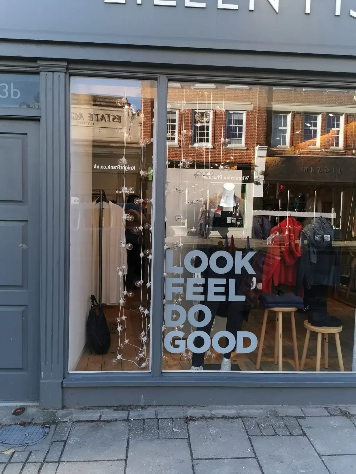
The window picture shows graphics on a shopfront. A window can carry a welcome, a small offer or a clue about what the business does. Use the space with care so the main entrance and inside of the shop are still visible. A message should help a person make a choice, not make them stop to read a wall of words before they can get inside.
Help all your signs feel like one business
Signs do not need to look exactly alike, but customers should be able to tell they belong to the same business. Use a few matching colours, familiar letter styles and the same names for rooms and services. The main shop sign may be bold, while a small direction sign can be quieter. Both can still feel related. Keep the business name, directions and notices in a clear order so one does not hide another.
Think about what a customer sees first, second and third. The shop name should not be hidden by an offer poster. A decorative wall picture should not cover a direction at a hallway turn. Walk through again and remove old notices or messages that repeat the same thing. A few useful signs are often calmer than lots of signs that say almost the same thing. Make sure every sign has a job before adding a new one.
Keep the information true as your business changes
Signs can become out of date when opening hours, rooms, staff or services change. Choose someone to check them and keep a simple list of where the signs are and what they say. Look at the list after a refit or a change to the way customers move through the space. Take down old temporary notices quickly. Check for signs that have faded, peeled or become hidden behind a shelf or new display.
Before making new signs, show the words and the planned places to people who work with customers. Ask if the directions match the way they explain the space. London Signage can help businesses think about window graphics, inside signs and signs outside as parts of the same visit. Start with the moments where customers hesitate, then plan only the signs that help them move on. When the words stay true and easy to see, people can spend more time enjoying their visit and less time trying to find their way. A short walk through the space with fresh eyes is a useful first step.
Commercial Signage London — Consider clear messages for your entrance and windows.
Talk with London Signage — Share where customers get stuck or need help.
Ask about signs for your space — Tell us what signs you are thinking about.
Questions about signs and customer visits
Frequently asked questions
How can signs make a customer visit easier?
They can help people spot your business, find the right place and understand what to do next. Keep the messages clear and up to date.
How many direction signs does my business need?
There is no set number. Add a direction where people need to choose a route, then ask someone new to the space to try it.
Should every sign look the same?
They can use the same colours and names without having the same shape. A shop name, an arrow and a short notice do different jobs.
When should I check my signs?
Check them when your hours, services or layout change. Also look from time to time for signs that are damaged, hidden or out of date.