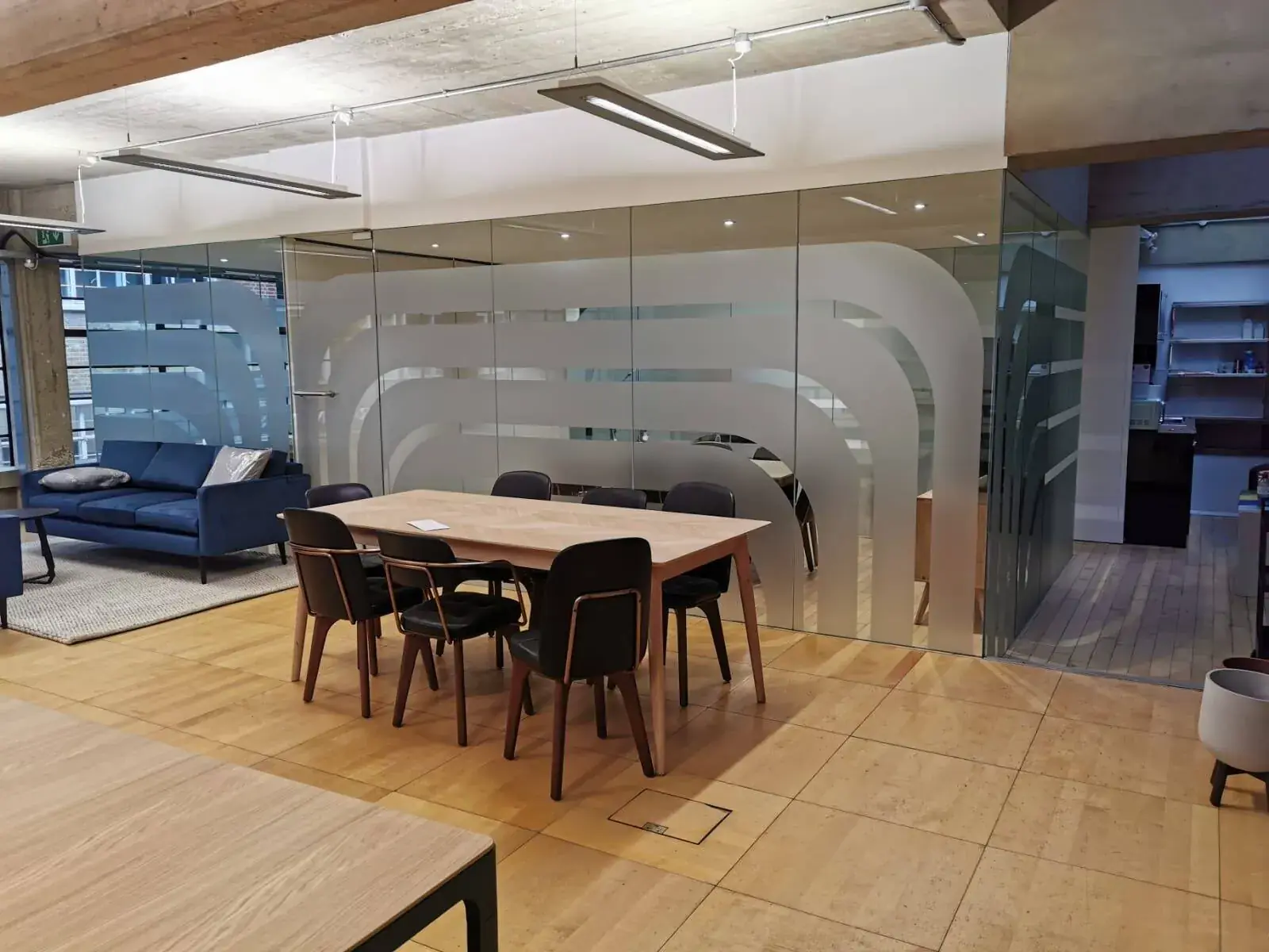
Business Signs
Clearer Signs for Every Business Visitor
Make business signs easier to see and understand with simple words, clear contrast, helpful placement and directions that work for more people.
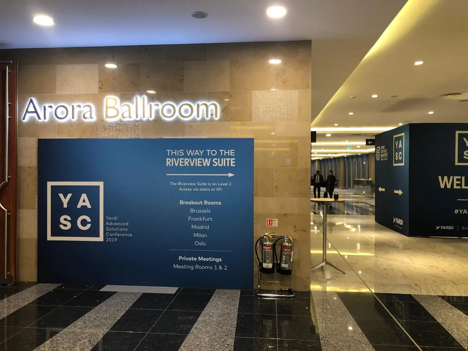
A sign helps only when people can see it, understand it and use it. Someone visiting your building may be in a hurry, carrying bags, unfamiliar with the rooms or looking from a seated position. Good signs do not assume that everyone reads, sees or moves in the same way. Simple words, clear colours and signs placed before a choice can make a visit easier for customers and staff alike. This guide shares practical ways to make business signs easier to use, from planning the route to checking a finished sign in its real place. Every building is different, and a short guide cannot replace a proper access review. Use these ideas to start useful conversations with your staff, visitors and sign maker.
1. Start with what people need to do
Before choosing colours or materials, write down the trips people make in your building. A visitor may need to find the entrance, reception, a meeting room or a toilet. A customer might need to know where to queue or collect an order. Walk each route as if you had never been there. Where do you have to choose a direction? Where might a door, plant or waiting group hide the view? What question would you have at each point? A sign that appears after a turning cannot help someone choose which way to go. It needs to come before the turn. Include the way back out too. A clear route plan helps you put signs where they are useful, rather than adding a sign to every empty wall.
2. Make the words easy to see and read
Letters need to be big enough for the distance people will read them from. Use a clear style of writing and leave space between words and lines. Thin letters, fancy curls or long lines of capital letters can slow people down. Make the words stand out from the background, such as dark letters on a light panel. Do not use colour as the only clue. If a blue arrow means one route and a green arrow means another, add words or clear pictures too. Check the sign where it will hang. A shiny surface, bright window or ceiling light may cause a reflection that hides the message. A design on a bright computer screen can look very different on a wall, so review a full-size copy in the real room before ordering.
Use words people know. A room called “The North Hub” may be familiar to staff but confusing to a first-time visitor. If the room is a meeting room, say so. Make the most important word or destination the easiest thing to spot, then add a short detail if needed. Use the same name on the sign, map, appointment message and staff instructions. Pictures can help, but not everyone knows what a new symbol means. Add a word beside an unfamiliar picture. Ask someone who has not worked on the sign to read it. If they have to ask what it means, rewrite it before it is made.
3. Put signs where people can see and reach them
A sign can be hidden by an open door, a tall plant, a queue or a new display. Walk up to it from the directions people will actually come from. Check that someone can stop and read without blocking a doorway or walkway. Put a direction where the choice happens and put a room name where someone can check they have arrived. If a message needs to work for people standing and sitting, look at it from both positions. Some signs also need to be within reach. A building access specialist can advise on the right height and position for your site. Do not place important words where sunlight or reflections make them hard to see. Move clutter or change the position if the message disappears.
4. Use the same names and arrows throughout
A group of signs is easier to follow when the same places have the same names all the way through. Decide what you call each floor, room and service, then use those names on entrance signs, maps, doors and messages. Keep arrows close to the words they point to. If an arrow sits between two lines of text, a visitor may not know which place it means. If the building changes, check the whole route so an old sign does not send someone in the wrong direction. A short list of approved names and colours can help staff order a replacement without changing the look or making a familiar route confusing.
5. Think about touch, cleaning and upkeep
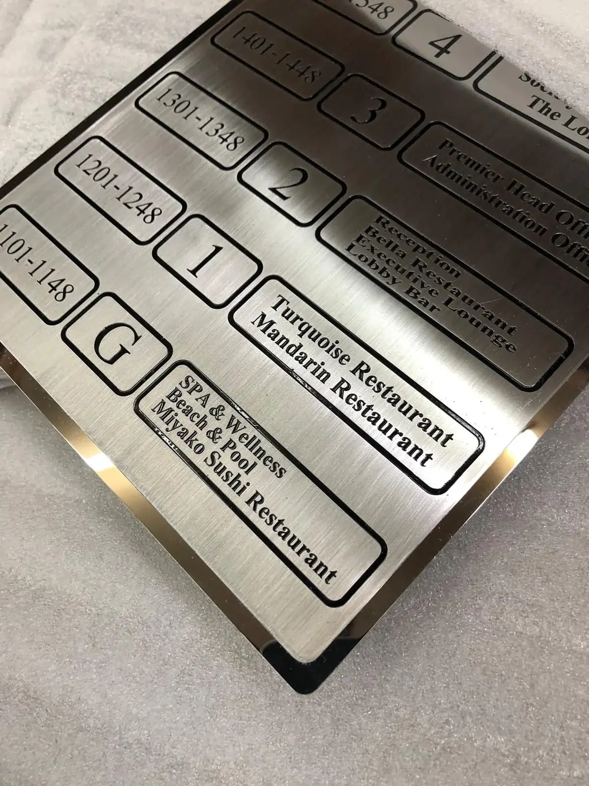
Some places may need raised letters or other information that can be felt by hand. Other places may need a clear printed sign in the right spot. What is useful depends on the building, the people using it and the sign’s job. Do not add raised details just as decoration or assume one special sign makes every part of a route easy to use. For complex sites, ask an access expert or people who use the building for advice while you are planning. The sign maker can help choose how a sign is made and fitted, but the whole route matters too. Materials also affect how people use a sign. A matte finish can help reduce glare. A surface that is easy to wipe can be useful near a busy entrance. Pick a finish that suits the room, cleaning products and how often the message may change.
A sign can become confusing if it is dirty, broken or out of date. Give someone the job of checking signs from time to time. Ask them to look for faded words, loose parts and directions that no longer match the building. When a room changes name or a service moves, update the signs and any maps or visitor messages too. Keeping signs in good shape is part of making them useful. If a repair or new sign is needed, keep a copy of the approved wording and design so the replacement does not introduce a different name or arrow.
6. Test the route before ordering every sign
Try the route before ordering a full set of signs. You can tape paper copies to the wall at the planned positions and ask someone who is new to the building to find a room. Watch where they pause, take a wrong turn or ask a question. Do not explain the route while they are trying it; the point is to see whether the signs do the work. Include people with different needs where possible and welcome honest comments. Check the names, spelling, arrows, floors and sign positions against the real building. If replacing every sign at once is too much, start with the places where people get lost most often. Keep a plan for the rest so that new signs still fit together.
Commercial Signage London — Find out about signs that help visitors follow a route.
Talk about easier signs for your site — Tell us about the building and where visitors need help.
Ask for a business sign quote — Share the site, the routes and the signs you may need.
Make clear signs part of a good visit
Clear business signs help people feel more certain about where to go and what to do. Begin with the routes and questions visitors face. Use familiar words, letters that are easy to read and colours that stand out. Put directions before a turn and check that signs are not hidden by doors, furniture or glare. Then ask people to try the route and tell you where they got stuck. No single colour, surface or letter style will work for every building, so review the signs in place and get expert advice when the site calls for it. London Signage can talk with you about signs for business interiors and visitor routes. Share a simple plan, photos and the places people find confusing, and you can discuss what to improve first.
Frequently asked questions
What makes a business sign easier for more people to use?
Familiar words, clear letters, strong contrast and signs placed before a choice can help. The best setup depends on the building and its visitors.
Should signs use different colours for different areas?
Colours can help, but do not make colour the only clue. Add words or clear pictures and check that the colours are easy to tell apart in the room.
Do all signs need raised letters?
No. Raised letters may help in some places, but the right choice depends on the sign and building. Ask an access expert when you need site-specific advice.
How do I test if signs work?
Ask someone new to the building to follow a route using the signs. Notice where they pause, take a wrong turn or ask for help.