Raised Letter Signs
A Simple Guide to 3D Business Letters
Learn how raised letters, materials, lighting and fitting can change the look of a shop, office or reception wall.
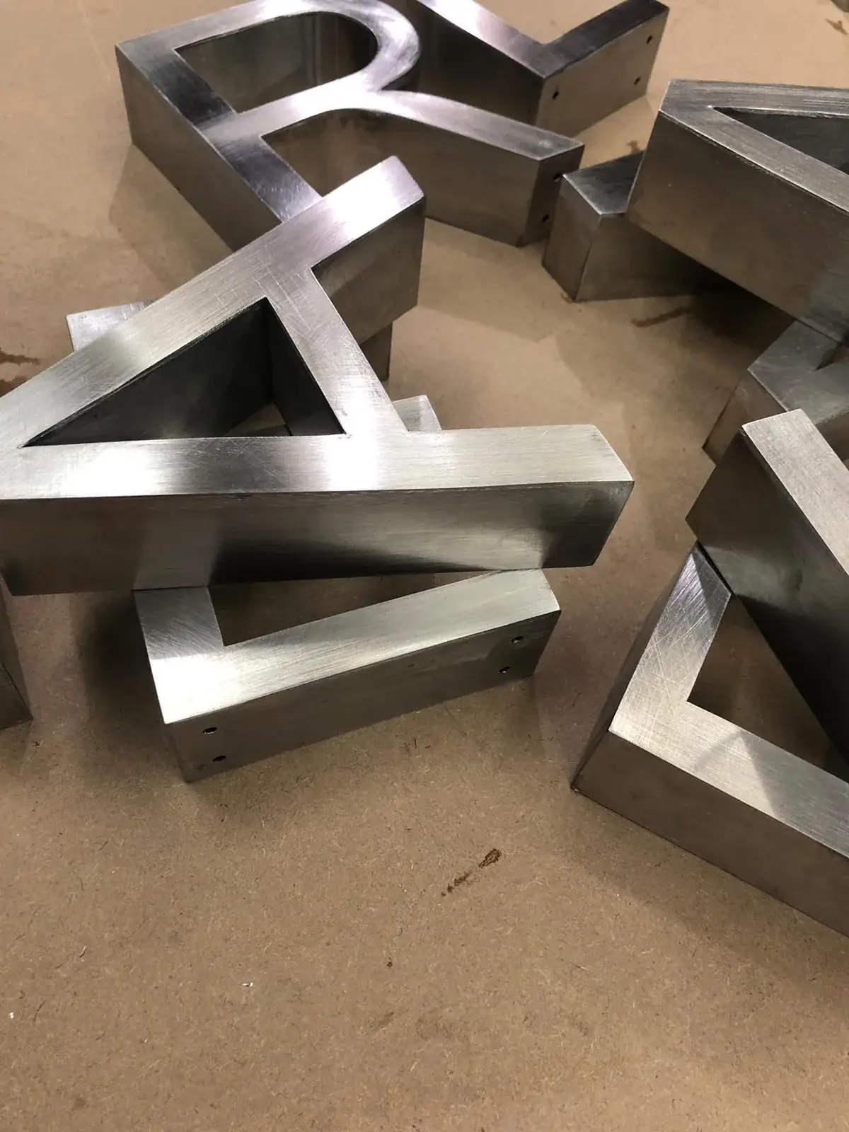
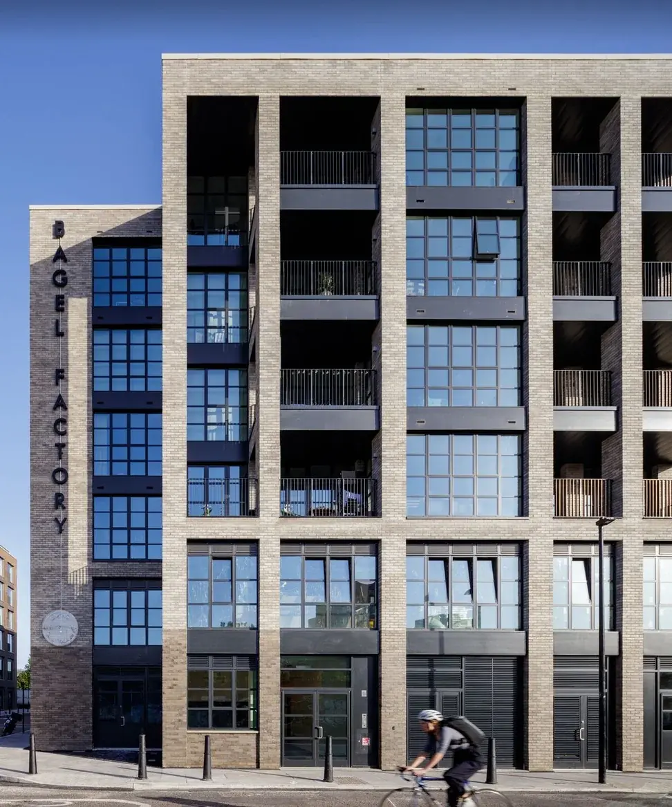
Raised letters give a shop name or logo a shape you can see and, sometimes, feel. They cast small shadows and can make a plain wall or shopfront look more finished. The words “3D letters” can mean a few different things: letters cut from a flat sheet, deeper letters with sides, or letters with lights inside. The best choice depends on where people will see them, what the wall is like and how the business wants to look. This guide is for owners planning a sign inside a reception area, on an office wall or above a shop. It explains the choices in everyday terms, so you can ask useful questions before a sign is made and fitted.
Choose how much depth the letters need
Flat-cut letters are cut from a sheet of material. They do not have deep sides, though they can stand a little away from the wall and cast a small shadow. Built-up letters have a front and sides, so they stick out further and look more like solid shapes. A group of letters may be fixed one by one, or set on a backing panel that holds the word together. Each choice looks different when viewed from the front or side.
Think about the distance from which customers will see the letters. In a small reception, visitors may stand close and notice the edges and shadows. On a shopfront, people may see the name from farther away, so the word shape and clear spacing matter more. Ask for a drawing that shows the front and side of the letters on the wall. A picture viewed straight on can hide how far the letters stick out or where the sides will show.
Pick a material and finish that fit the place
Acrylic is a smooth plastic that comes in different colours. Aluminium and stainless steel are metals that can have painted, brushed or shiny finishes. A sign can use one material or combine a front face with sides made from another. There is no single best choice for every wall. Think about whether the sign is indoors or outdoors, how much weather it may face, how it should look and how much cleaning it will need.
A small sample can look different when it is placed under your actual lights and beside your wall colour. A shiny finish may reflect lamps, while a dull one may look calmer. Ask to see a sample if the colour or surface is important to your brand. Look at the edges too, not just the front. Ask how to clean the material and whether its colour or finish may change in sun or rain. These questions help you choose a sign you will still be happy to see every day.
Make sure your logo works as real letters
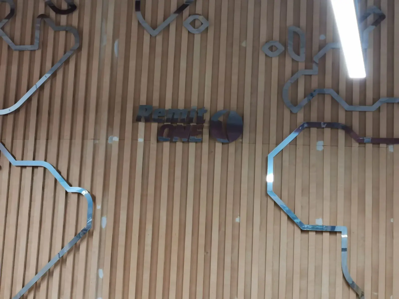
A logo made for a computer screen may have very thin lines or tiny spaces. Those details can be hard to cut or make as separate letters. Give the sign maker the best logo file you have and point out any parts that must stay just as they are. Ask whether details need to be made a little wider or larger at the finished size. Small changes can help the letters look like the logo while making them strong enough to make and fit.
Look at the word from the places customers will stand. Letters that are too close can look joined when shadows fall across them. If the logo has a picture and words, check that the two parts feel balanced. Think about the nearby door, desk, lights and wall edges. A sign that lines up with the room can feel neat and easy to notice. Ask to check a full-size paper layout on the wall if the size or position is hard to picture.
Decide if light belongs inside the letters
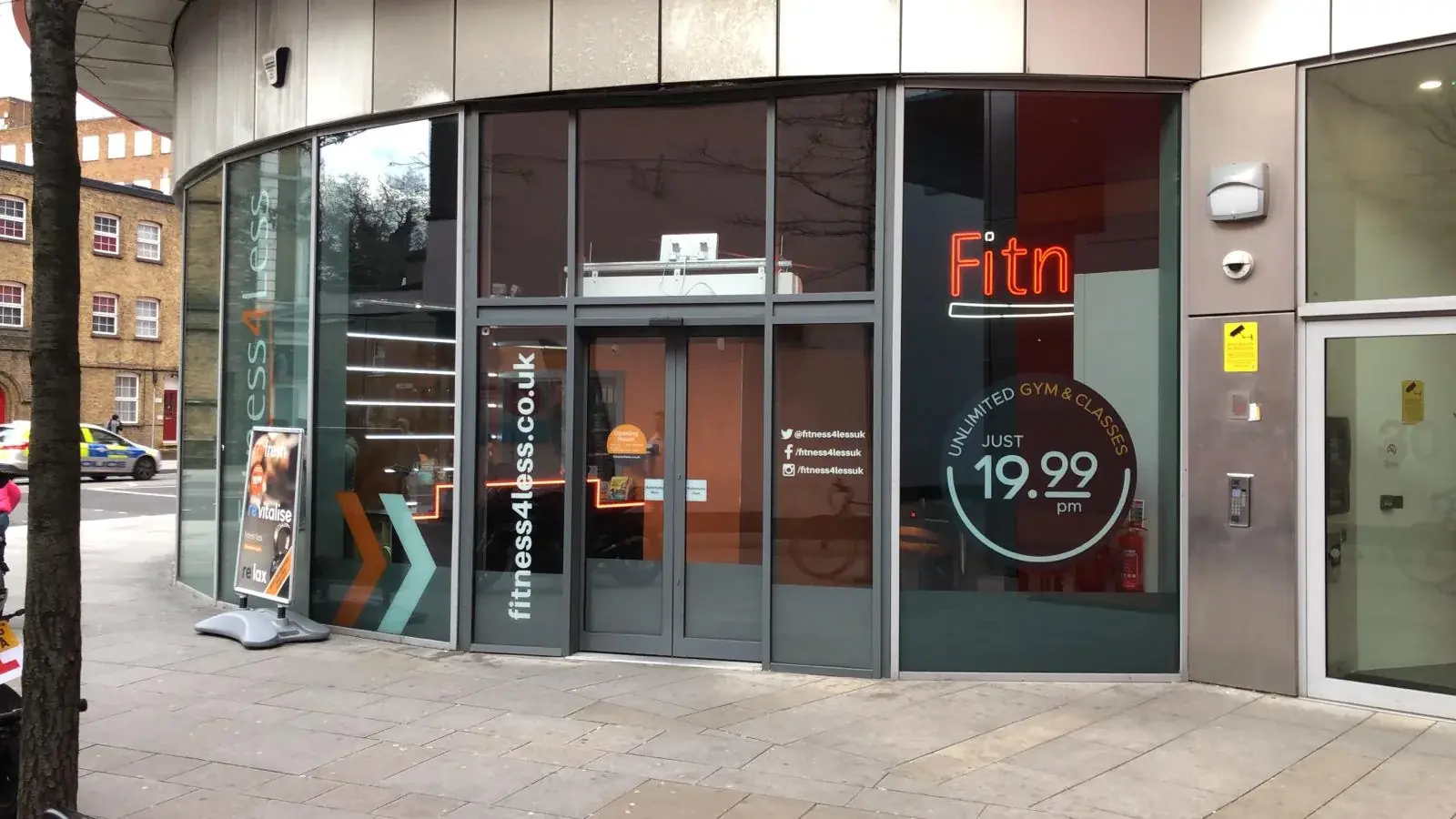
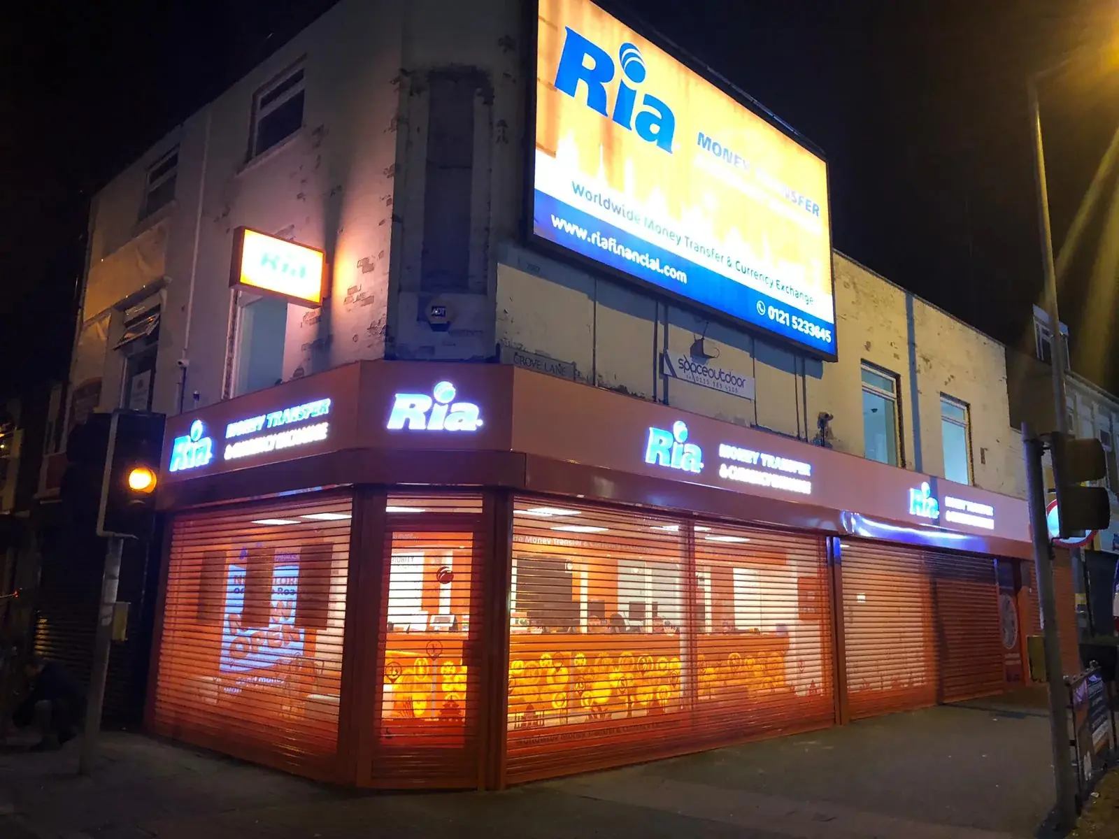
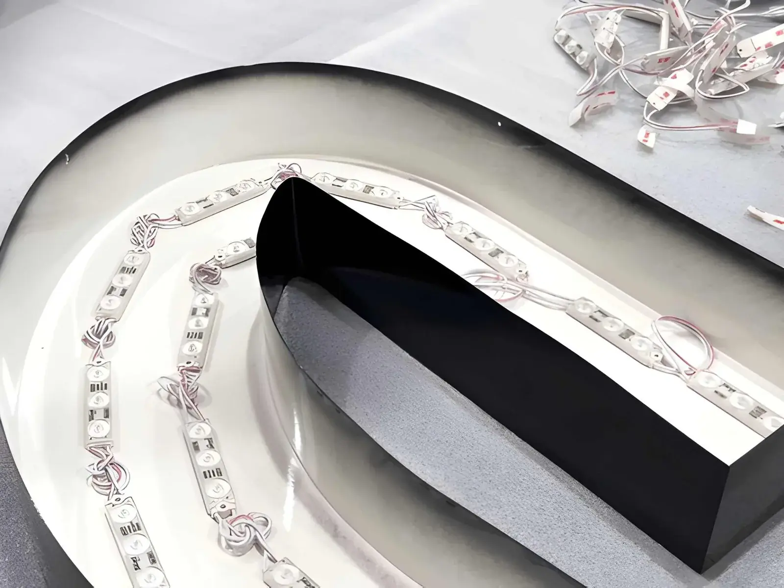
Raised letters can be lit in a few ways. Light may shine through the front, or shine backwards onto the wall to make a glow around the letters. Some signs use a separate lamp nearby instead. Letters without lights can still work well in a bright reception or shop. The right choice depends on whether people need to see the sign after dark and on how the wall and room lights affect it.
LED means a small light used inside many signs. Ask to see a picture of the lighting effect on a wall close to yours, because the wall colour and texture can change how a glow looks. Find out where power will come from and how someone can reach the lights if they need care. A sign may look tidy from the front but be awkward to repair if nobody can reach its parts. Plan the light and its upkeep together.
Check the wall and how letters will be fixed
Raised letters can be fixed straight to a wall, held away from it with small pins or spacers, or attached to a backing panel. The wall matters. Brick, plaster, stone, window glass and metal panels need different ways of holding the sign safely. Share clear photos and any details you have about the wall. If nobody knows what is behind the surface or whether it is strong enough, ask for someone to check before agreeing how the letters will be fixed.
Ask how the fitter will keep the letters level and evenly spaced. A full-size paper guide can show exactly where each letter will go. Confirm who supplies it and whether the wall needs cleaning or repair first. For a busy shop or office, agree when fitting will happen and how visitors will be kept away from the work area. If the sign is high up, talk with the fitter about safe access. Good planning protects the wall and helps the finished name look straight.
Think about cleaning and future care
Dust can collect on top of raised letters and dirt can gather around their sides, especially outside. Ask how the letters should be cleaned and whether the place they are fitted makes them easy to reach. Some finishes can be marked by strong cleaners or rough cloths, so follow the care advice for the exact material. If any letter becomes loose, damaged or unevenly lit, contact a professional rather than trying to fix a high sign yourself.
Before the sign is made, ask how any lights can be reached and whether one part can be repaired without taking everything down. Keep a copy of the approved drawing and details about the materials. They may help if you need a replacement letter or want to add another sign later. Indoor letters need care too: fingerprints, dust and cleaning products can affect their appearance. A simple care plan helps the sign keep looking tidy.
Agree the important details before making begins
Ask for a written drawing or plan that shows the overall size, letter height and depth, material, finish, lighting and how the sign will be fixed. Check where it will sit on the wall and whether fitting, power work, access equipment or removal of an old sign is included. Read the business name and look at every colour before you approve it. It is much easier to correct a mistake on a drawing than after the letters have been made.
Do not judge the sign only by a front-facing computer picture. Ask what the edges look like, how it will sit on the wall and how it can be cared for. London Signage can discuss raised lettering and fitting plans for business premises. Bring the logo, a photo of the wall and an idea of where visitors will stand. This gives everyone a clearer starting point and helps the final sign feel right in the actual room or on the actual building.
3D Built-Up Letters London — Explore raised lettering for shopfronts and business interiors.
Talk about your lettering — Share your logo, wall photo and sign ideas.
Ask for a lettering quote — Send the sign size and place where you want it fitted.
Conclusion: choose letters that suit the wall
Raised letters can give a business name depth and help it stand out, but the right sign is about more than thickness. Choose a material and finish that suit the place, make sure the logo can be made clearly and check how the letters will be fixed. If you want lights, ask how they will look on your wall and how they can be reached later. London Signage can talk through raised-letter designs and fitting plans with business owners. Bring your logo and photos of the site to start. A clear plan helps you get a sign that looks good from the doorway or pavement and can be cared for after the fitters leave.
Frequently asked questions
What is the difference between flat and built-up letters?
Flat letters are cut from a sheet and have little depth. Built-up letters have a front and sides, so they stick out further from the wall.
Which material should I choose for raised letters?
Acrylic is a smooth plastic, while metals can have different painted or shiny finishes. Think about where the sign will go, how it should look and how it will be cleaned.
Can raised letters have lights?
Yes. Light can shine through the front or onto the wall behind the letters. Ask to see how the effect may look on your wall.
Can raised letters go on any wall?
The wall and its condition need to be checked before choosing how to fix the letters. Send photos and ask for a site check if you are unsure what the wall is made of.